Work · Case study
Web agency website: services, process and success stories
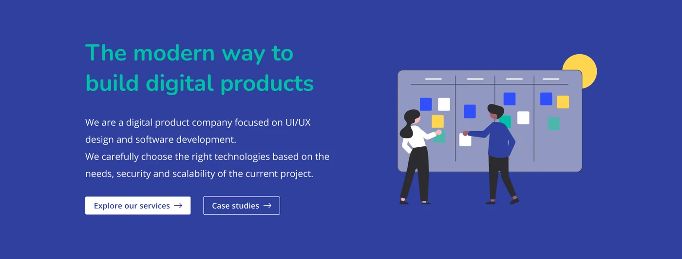
A marketing website for a web agency: what the company does, how it works and the projects it is proud of, on desktop and mobile.
- Client
- A web agency
- Type
- Marketing website
- Platforms
- Desktop and mobile web
- Focus
- UI, layouts, design system
- Tools
- Figma
Overview
The website of a web agency that designs and builds web and mobile products. It has one job: explain what the agency does, show how it works and make it easy to get in touch.
This was a real client project. For confidentiality the client is not named and the logo is not shown.
Navigation and services
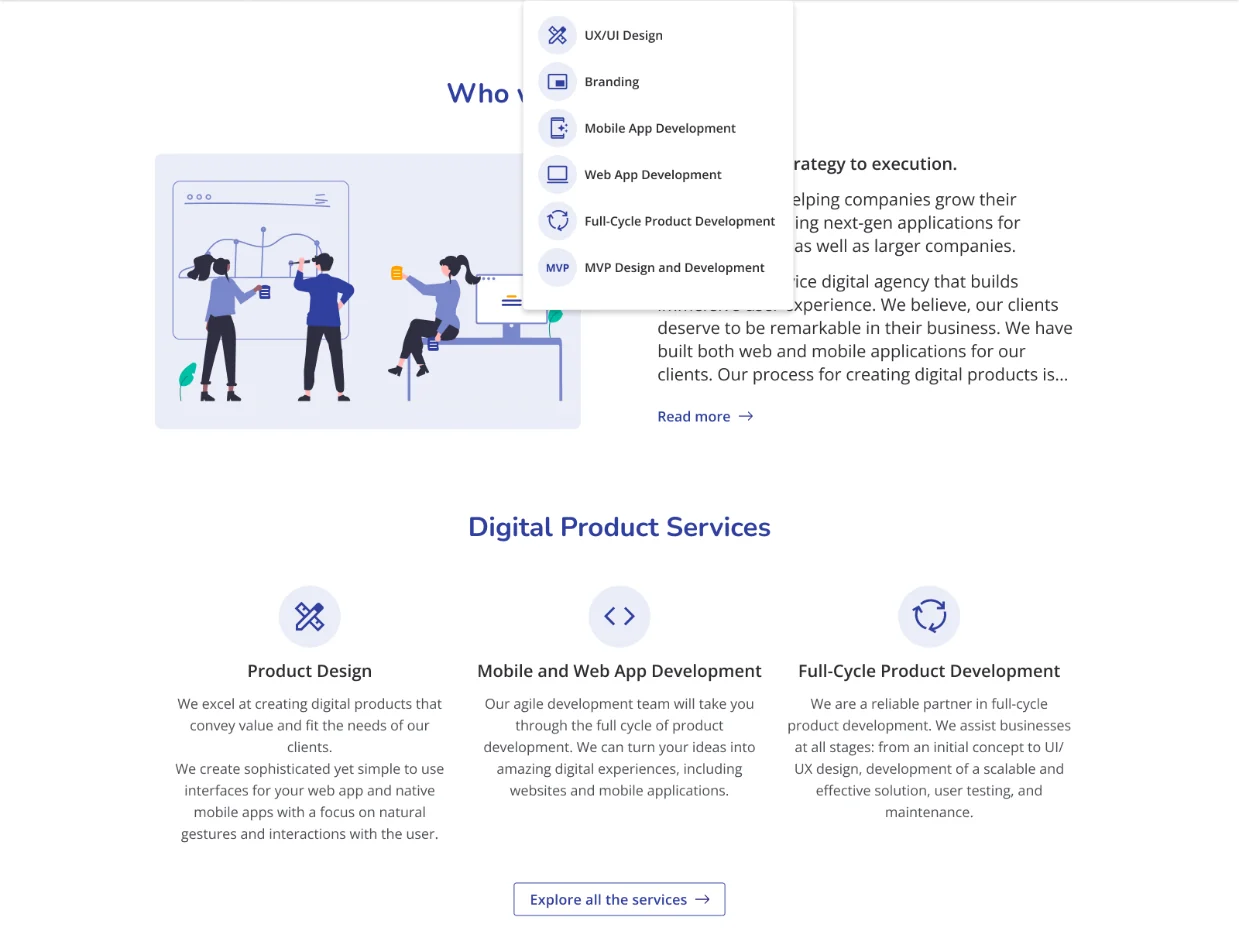
The main navigation has five entries: Mobile, Web, Services, Case studies and Contact, and a Work with us button that stays in the header. Services opens a menu with six services, each with its own icon, so visitors can jump straight to what they need.
Home page
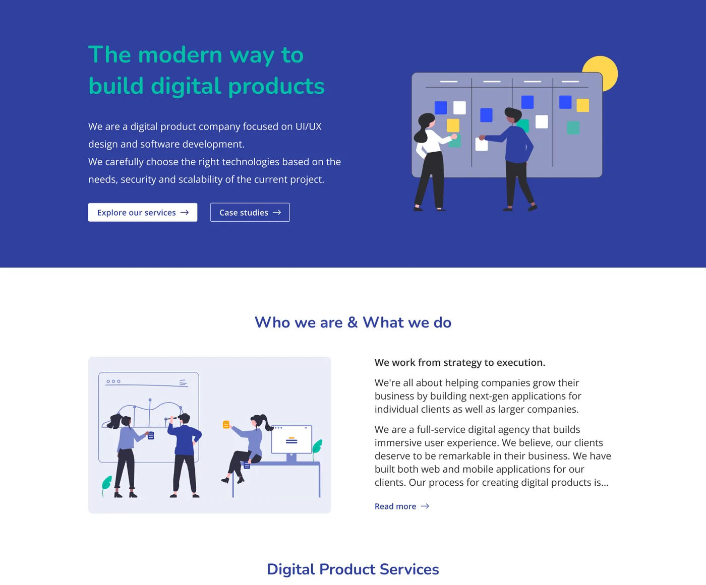
The home page opens with a short statement of what the company does and two actions: Explore our services and Case studies. Below it come a short introduction, three service cards, a six-step process, success stories, technologies, client reviews and a contact form.
The sections alternate between white and coloured bands, which gives a long page a clear rhythm.
Service pages
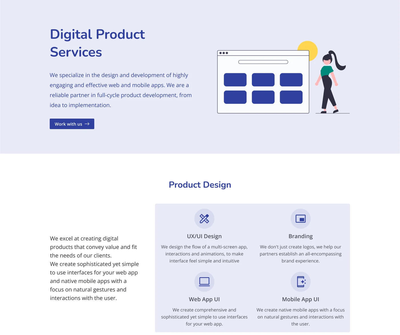
The Mobile and Web pages share one template: an intro with one action, a short introduction, three services, the process and related success stories.
The Services page groups the offer into three blocks of four items, each with an icon, a title and a one-line description, so the whole offer can be scanned in a minute.
Mobile
On mobile the navigation collapses into a menu, the hero stacks text, buttons and illustration, and the cards become one column.
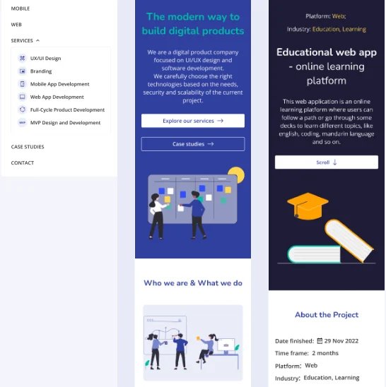 Menu, home page and project page
Design system
A short style guide kept the colours and the type consistent across pages. Indigo is the primary colour, teal the secondary and amber the accent. Body text is Open Sans at 16 px, subtitles are 22 px and titles are 35 px in Nunito.
- Primary#303F9F
- Primary dark#241D78
- Secondary#00897B
- Secondary dark#006969
- Accent#FFA000
- Text#2C2C31
- Open Sans
- Nunito
- Primary and secondary buttons
- Service cards
- Icon circles
- Process steps
A note on screens
This was a client project, so the agency name, logo and contact details are not shown. I am happy to walk through the pages and decisions in an interview.
Let's work together
Let's work on something together
Tell me about your project or role. A few lines about the product, the goal and the timeline is enough to start the conversation.