Work · Case study
Nature’s Bounty: an e-commerce UI concept for a vegan, handmade store
An online shop for handmade soy candles, natural soaps and bath salts, designed from the homepage to the basket on desktop and mobile, with a Figma design system.
- Type
- E-commerce UI concept
- Platforms
- Desktop and mobile web
- Role
- UX/UI design, design system
- Focus
- Accessibility and trust
- Tools
- Figma
Overview
A UI concept for an online shop selling handmade soy candles, natural soaps and bath salts. It draws on my experience designing online stores for natural products: what shoppers compare before they buy, what helps a small brand earn trust, and where people hesitate.
This is a concept project and is not affiliated with any existing brand.
Visual direction
The look is warm and botanical, with soft photography, a peach and sage palette and a hand-lettered logotype. Behind it, every screen follows Baymard Institute e-commerce research and WCAG 2.2 AA accessibility guidelines.
Homepage
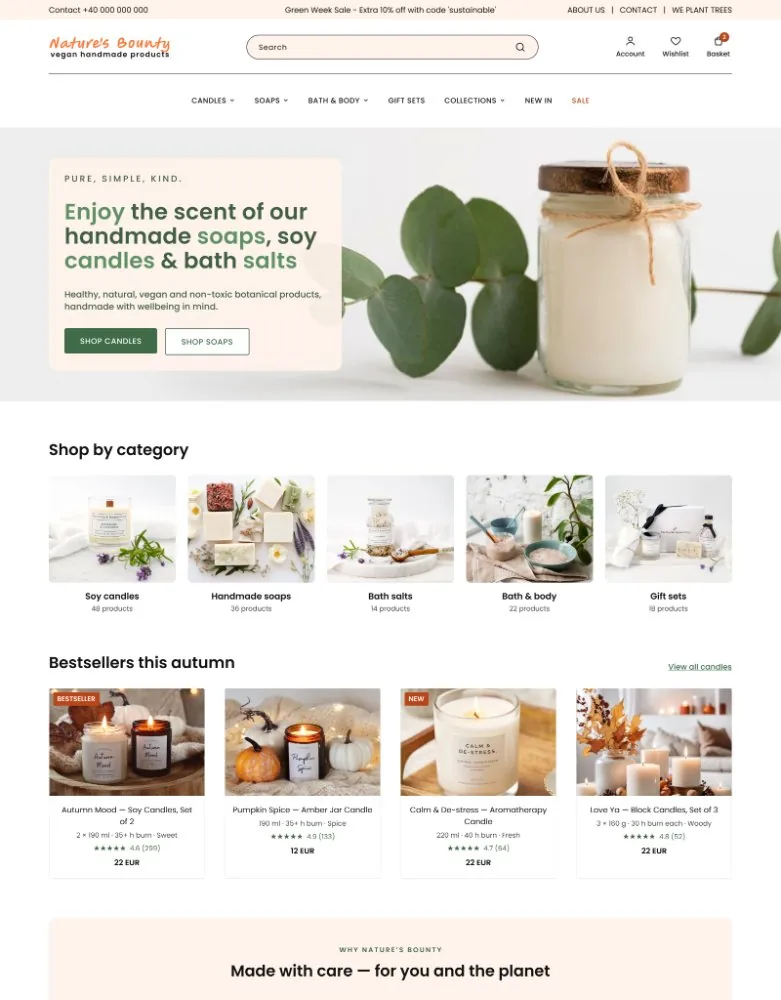
The homepage opens with a short promise and two clear actions, then shows categories, bestsellers with prices and ratings, collections and customer reviews.
A trust strip with delivery, returns and payment information sits above the newsletter sign-up.
Category page
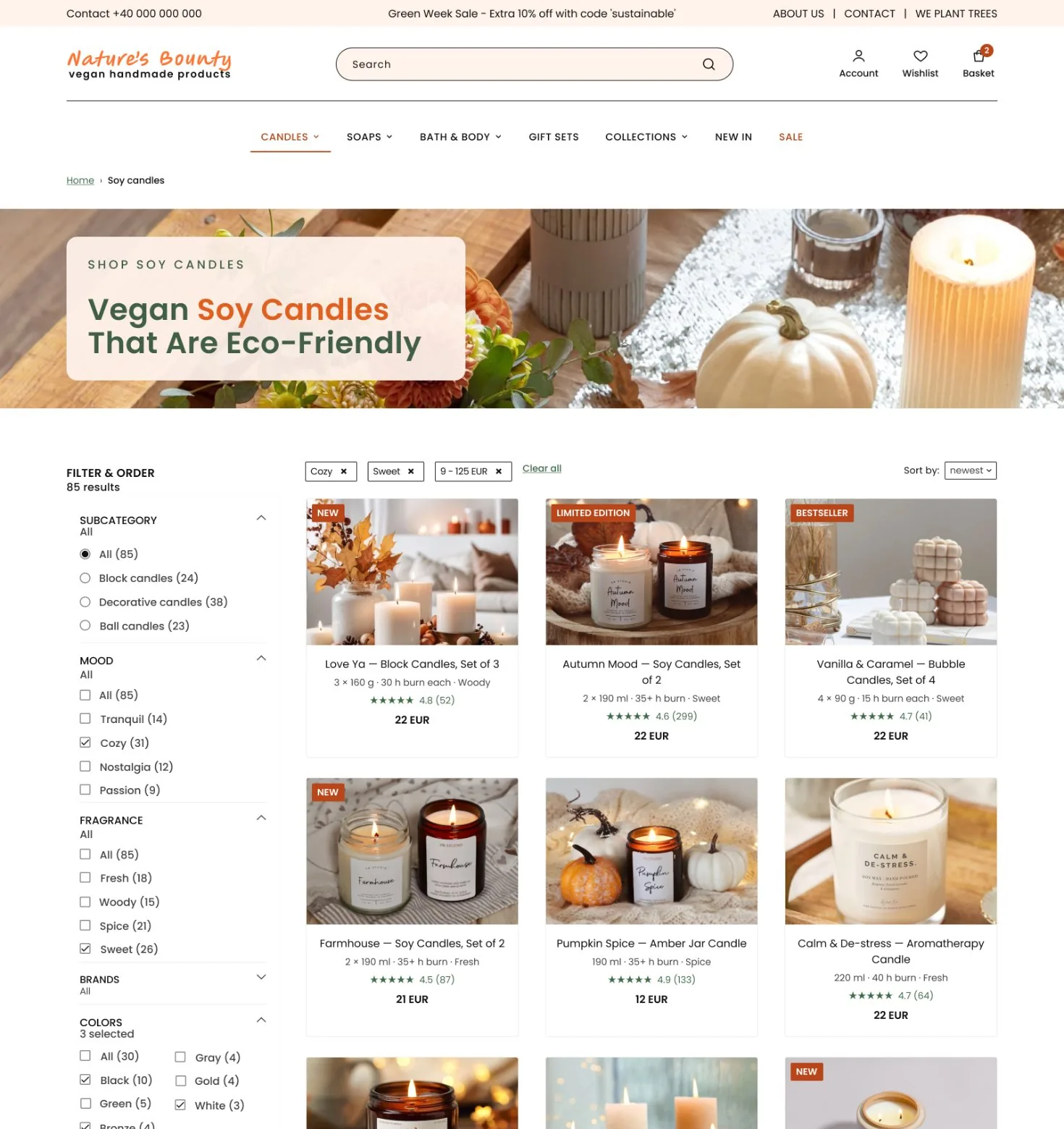
A compact header lets the products appear straight away. The page has breadcrumbs, filters with counts, a Clear all action, and price inputs alongside the slider.
Product cards show size, burn time, scent and rating: the details shoppers compare most.
Product page
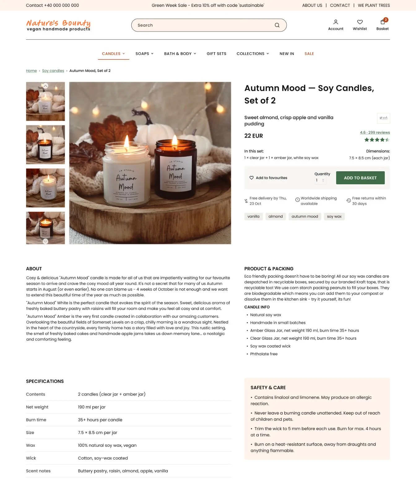
The product page shows the delivery date, the contents of the set, specifications, safety and care information and reviews, on a consistent two-column grid.
Collections and about
The collections page lets visitors filter by occasion, mood and scent. The about page explains ingredients and packaging.
Header and footer follow the same rules everywhere: labelled icons with a basket count, and a full customer service footer.
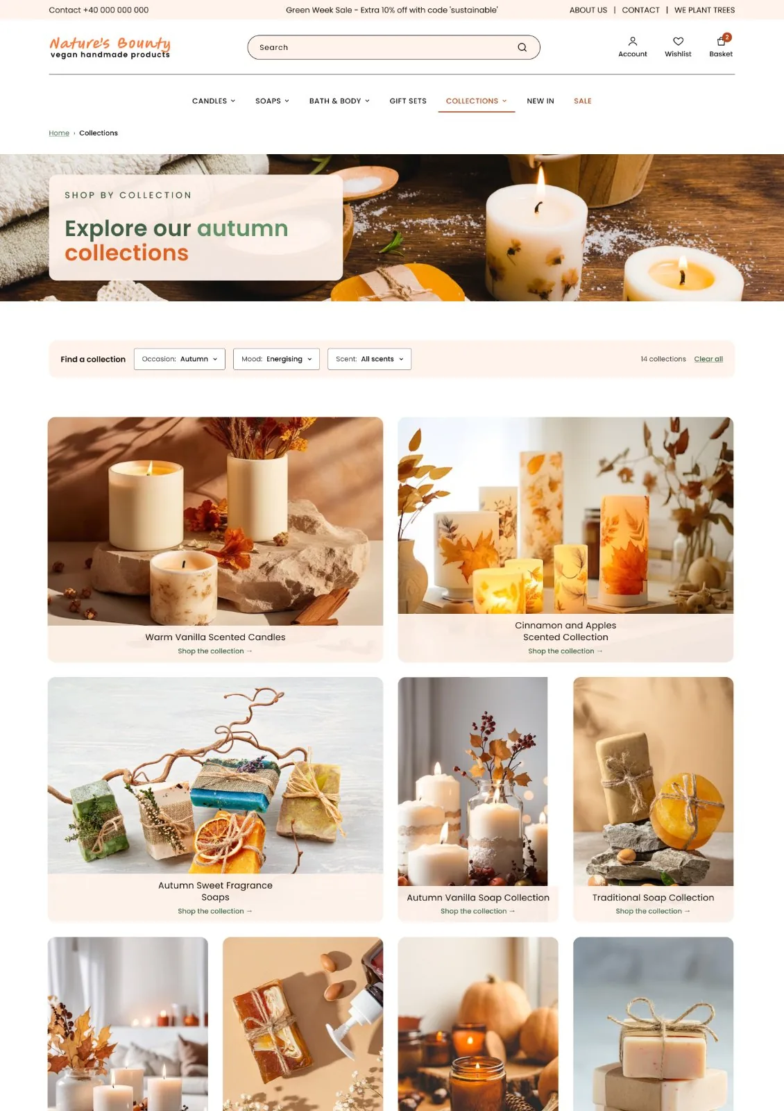 Collections
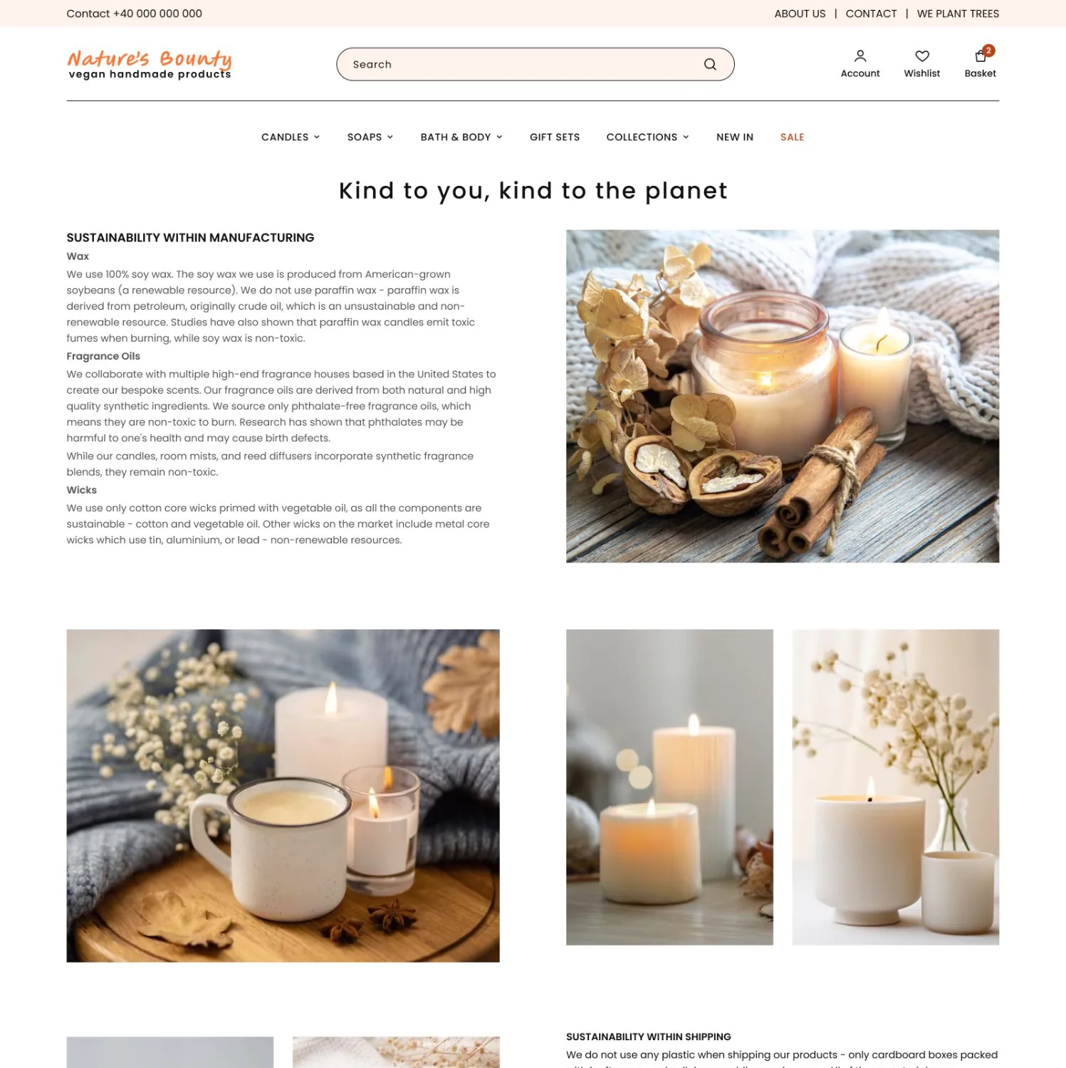 About: ingredients and packaging
Mobile
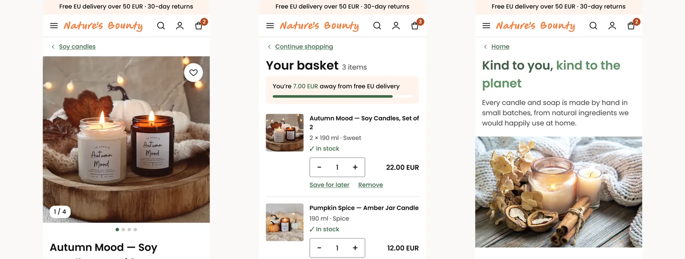
The same structure carries over to a 390 px layout: categories first, scrollable filters, a two-column product grid, collapsible product details and a basket with free-delivery progress and guest checkout.
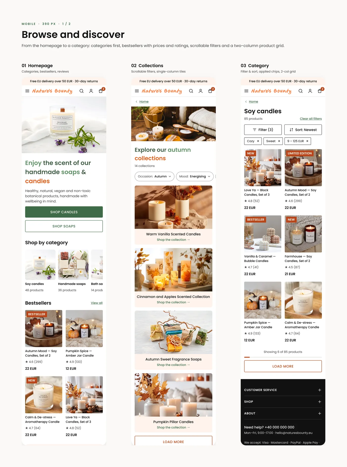 Browse and discover
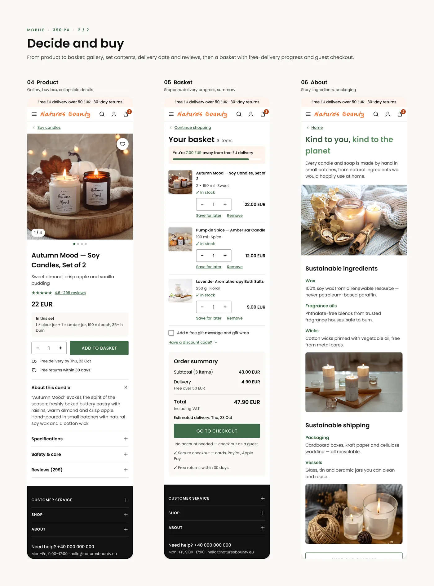 Decide and buy
Accessibility
The brand colours are paired with darker working shades, so text and actions reach 4.5:1 contrast. Lighter accents are kept for large headlines.
- Text never goes below 14 px.
- Interactive targets are at least 24 × 24 px.
- Icons always have visible labels.
Design system
Built in Figma with 13 colour styles, 5 text styles and reusable components: Button, Badge, Filter chip, Header actions, Product card and Footer. Poppins is used across the interface, with the hand-lettered logotype as the only exception.
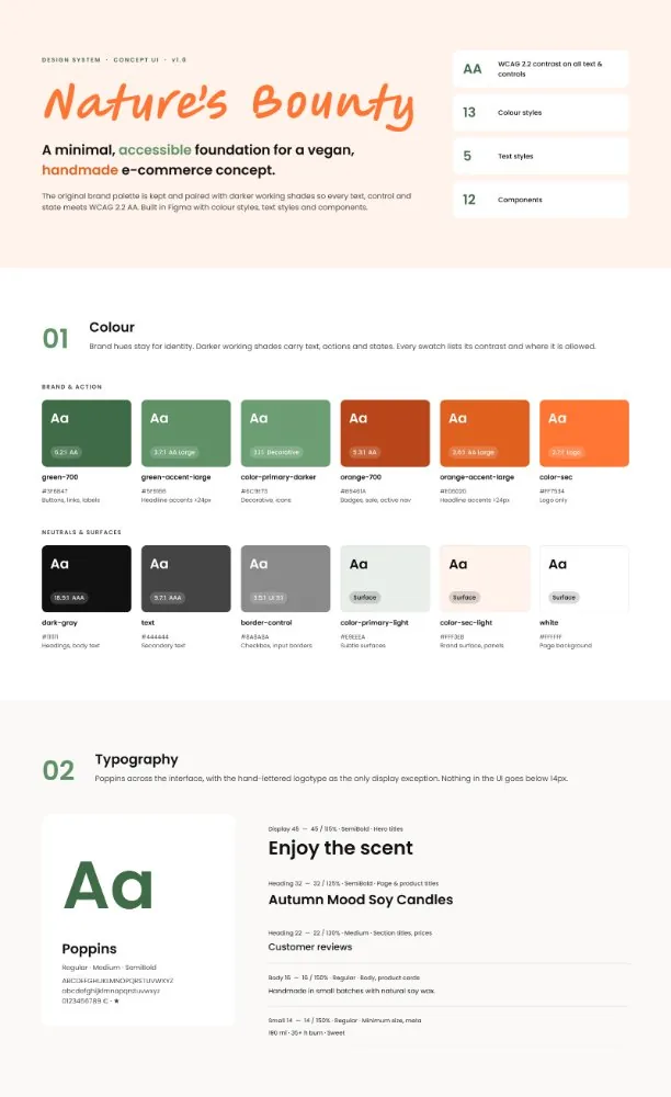
- 13 colour styles
- 5 text styles
- Button
- Badge
- Filter chip
- Header actions
- Product card
- Footer
A note on the project
This is a concept project, so the brand and the products are fictional. I am happy to walk through the decisions behind any screen in an interview.
Let's work together
Let's work on something together
Tell me about your project or role. A few lines about the product, the goal and the timeline is enough to start the conversation.