Work · Case study
E-commerce: a lighting store with category, product and inspiration pages
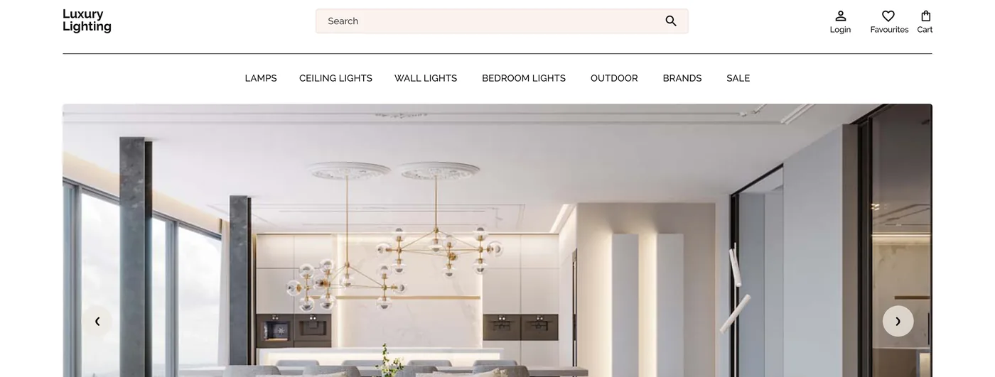
An online store for lamps, ceiling lights, wall lights, bedroom lights and outdoor lighting, designed for browsing by style as well as by product type.
- Type
- E-commerce store
- Platform
- Desktop and mobile web
- Focus
- UX/UI, page layouts, design system
- Pages
- Home, category, product, inspiration, shop the look, basket, delivery and returns
- Typeface
- Raleway
Overview
An online store for luxury lighting. The main navigation follows how people shop for lights: Lamps, Ceiling lights, Wall lights, Bedroom lights, Outdoor, Brands and Sale. Besides the category and product pages, the store has an inspiration page where room photos lead to the products in them, a shop-the-look page, a five-step basket, a delivery and returns page and mobile layouts, all built on one small design system.
Home page
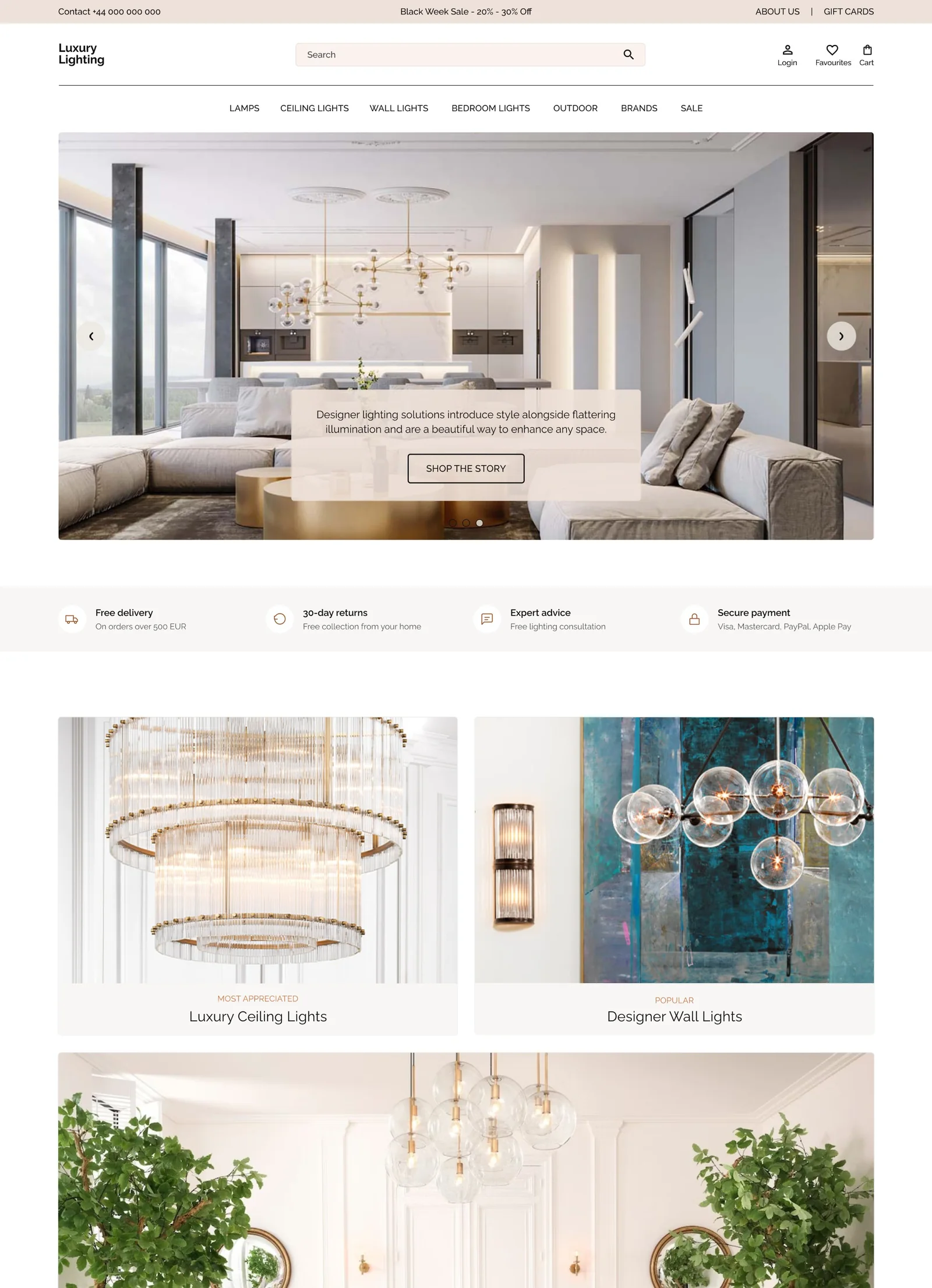
The home page opens with a slider and a short statement, then a row of four reassurances: free delivery, 30-day returns, expert advice and secure payment. Large image tiles lead into the main ranges, followed by best sellers, a free video consultation banner, an Instagram feed and a newsletter sign-up.
Category page
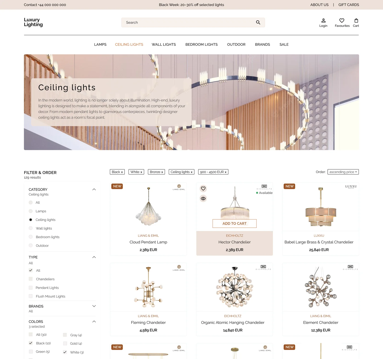
Filters on the left (category, type, brands, colours, price and availability) show the number of results. Selected filters appear as removable tags above the grid, and the cards show brand, name and price. On hover, a card adds favourite and quick view buttons, availability and Add to cart.
Product page
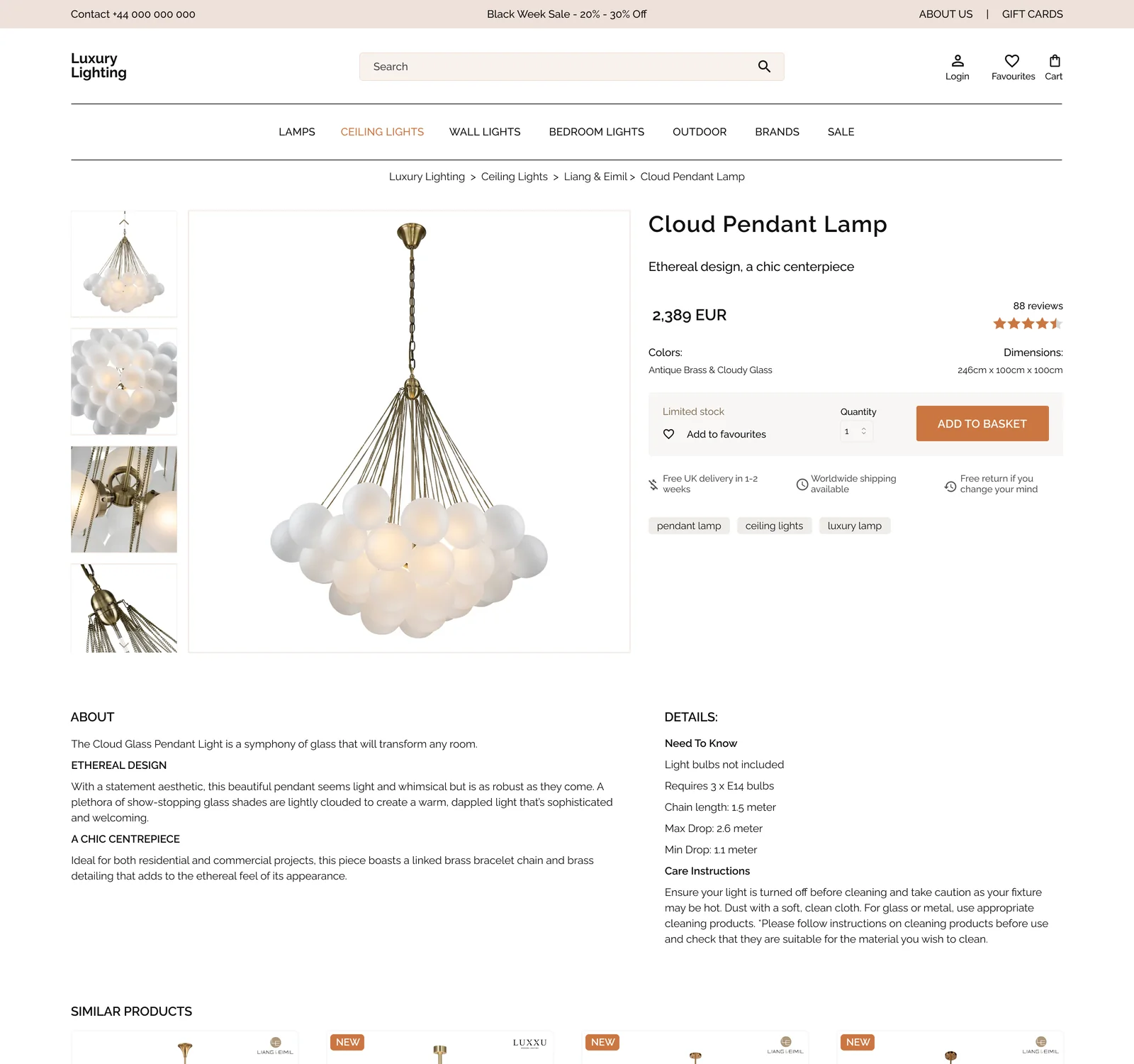
The product page has an image gallery with thumbnails, the price, colour and dimensions, stock status, quantity, add to favourites and an Add to basket button, with delivery and returns notes under it. Below come the description, details and care instructions, similar products, and customer reviews with a rating summary, filters and a Write a review button.
Inspiration page
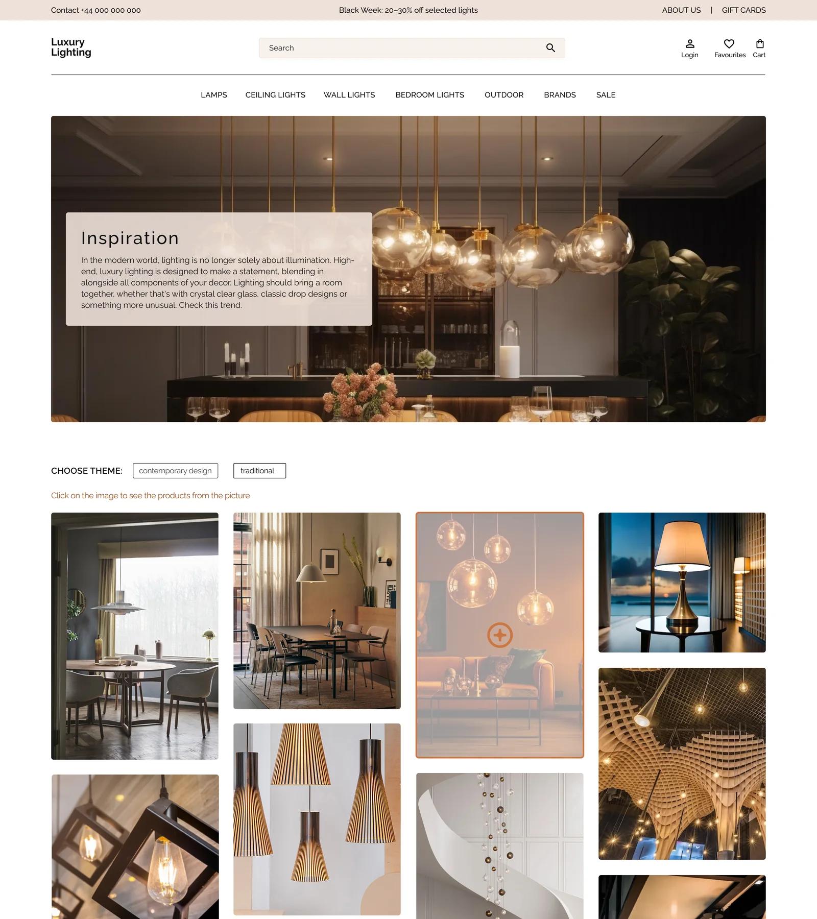
A page of room photos grouped by theme, contemporary design and traditional. Selecting a photo shows the products in the picture, so visitors can shop a look instead of searching for a single item.
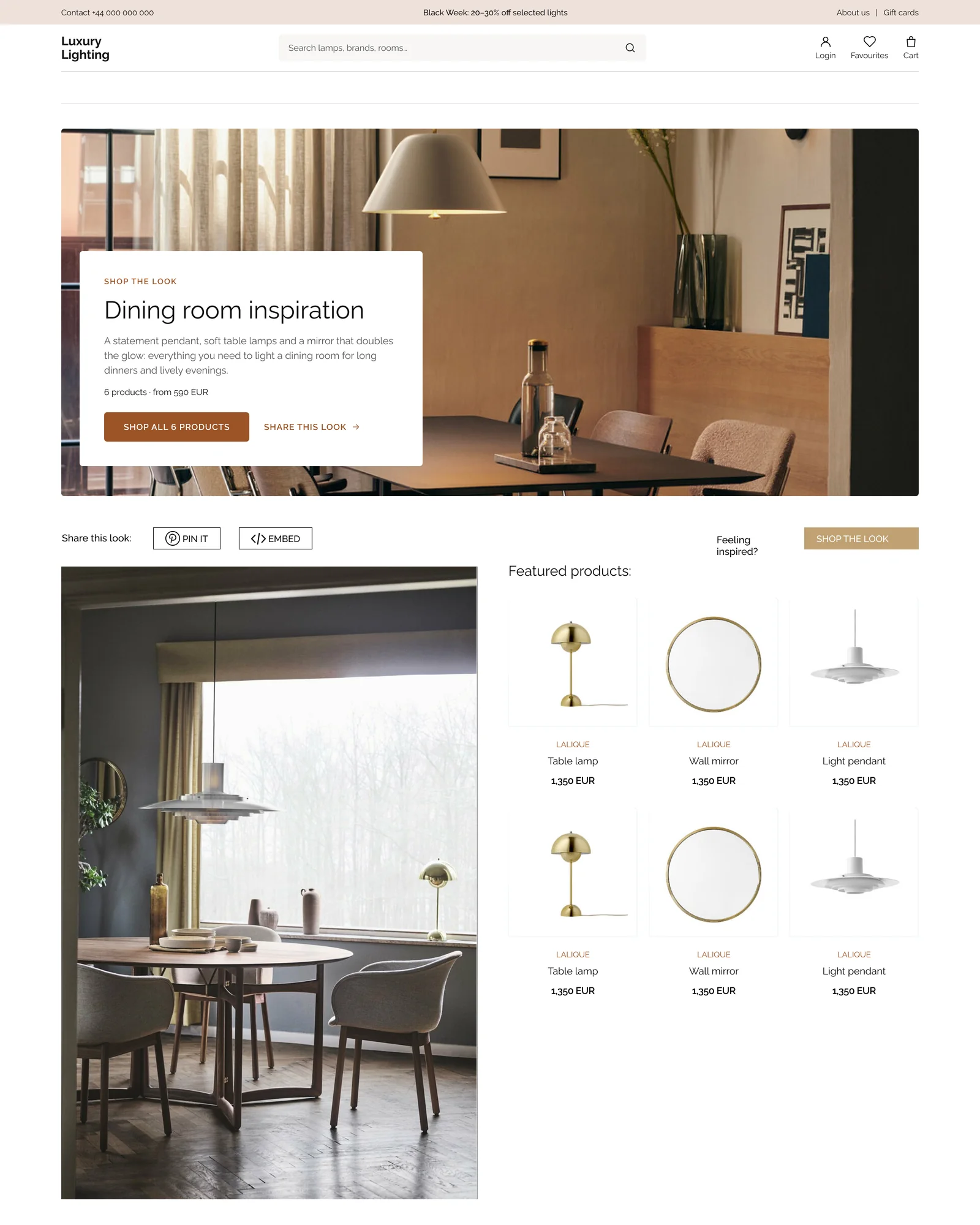
Shop the look
A page for one room, a dining room. A large photo carries a short description, the number of products and the starting price, and one main button: Shop all 6 products. Under it, the room photo sits next to the featured products, and the look can be shared with Pin it or Embed.
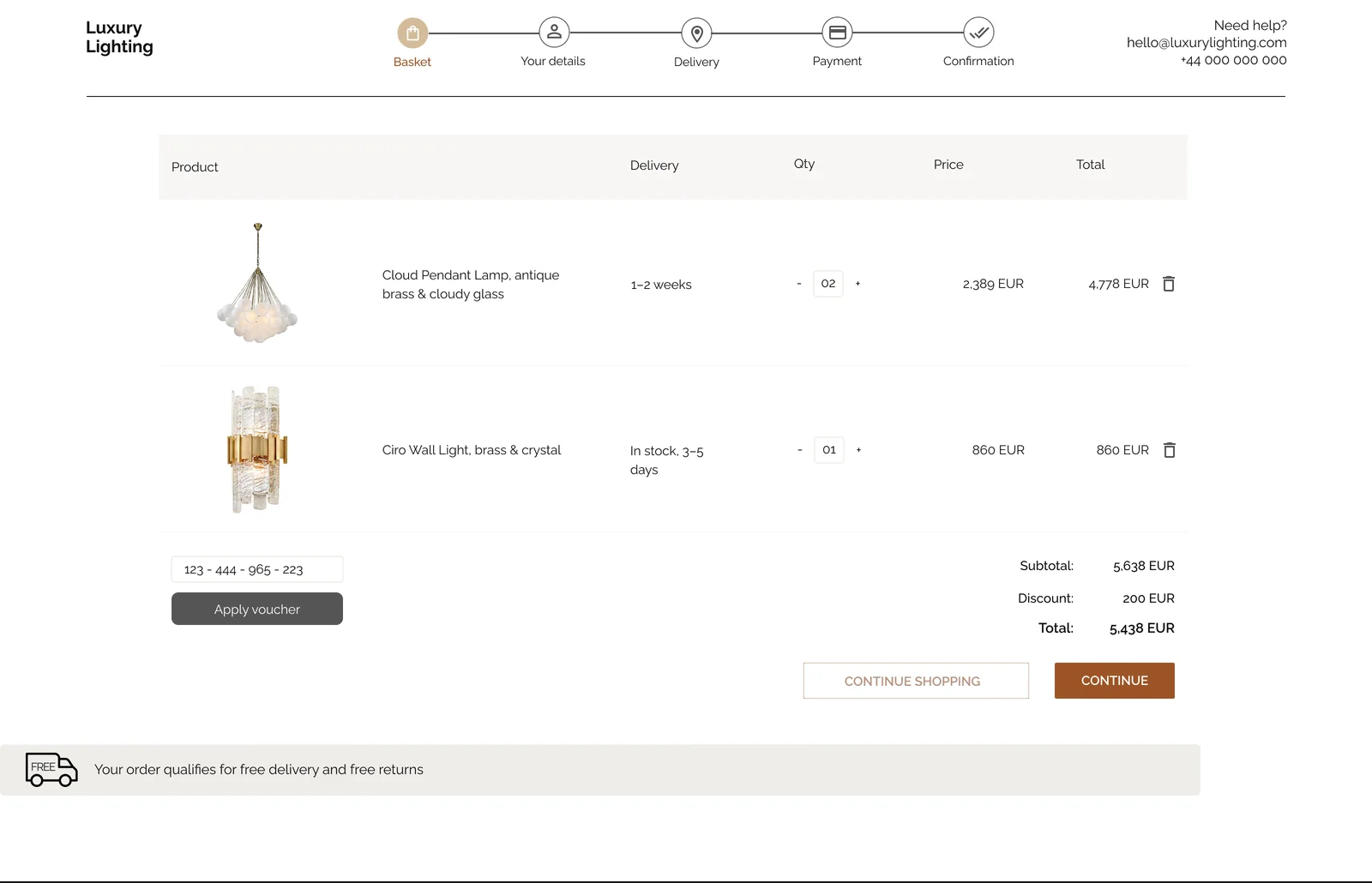
Basket
A five-step bar shows where the customer is: Basket, Your details, Delivery, Payment and Confirmation. The basket lists each product with its delivery time, quantity, price and total. A voucher field, a subtotal, the discount and the total follow, and a message confirms that the order qualifies for free delivery and free returns.
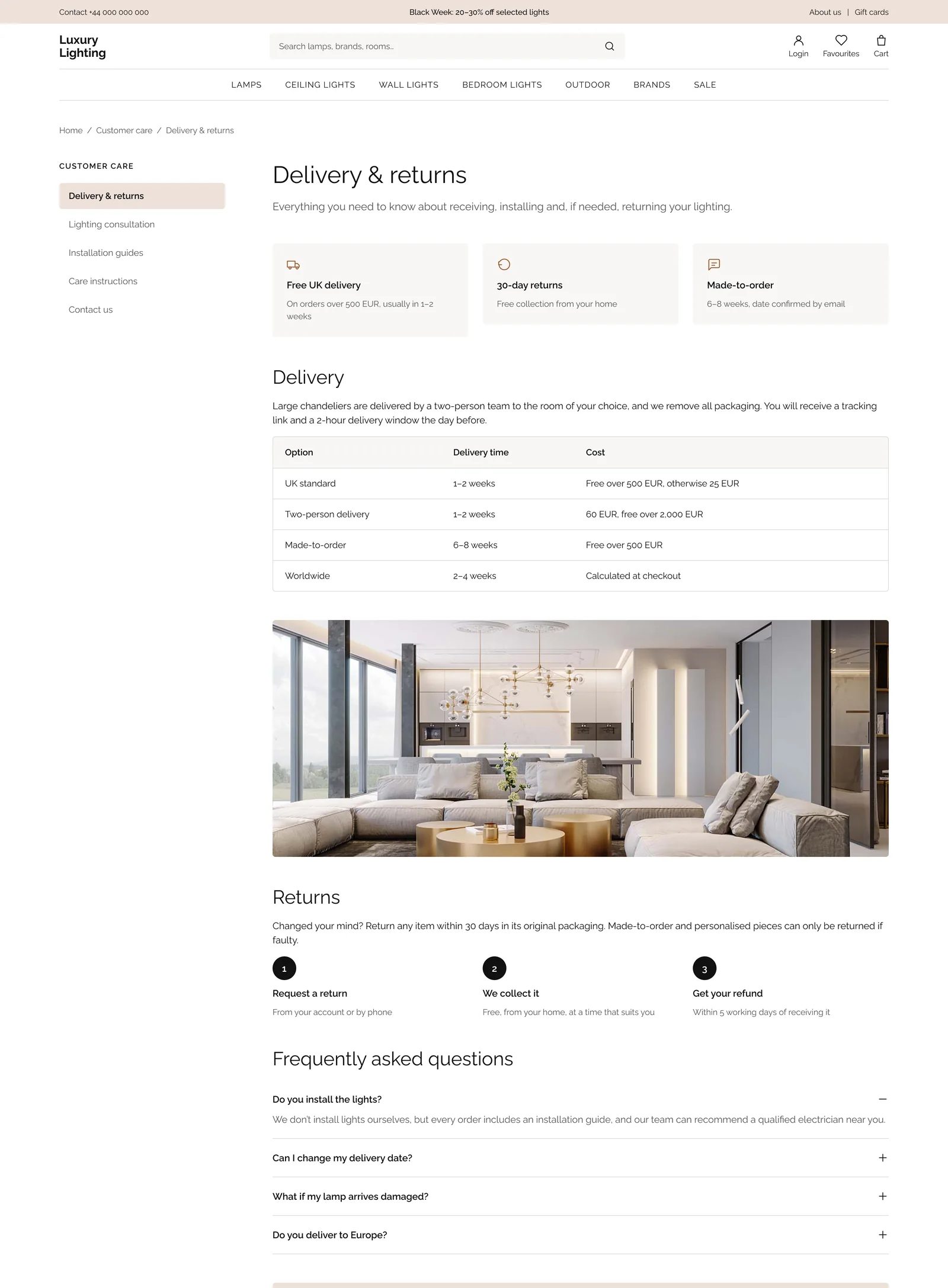
Delivery and returns
A help page that answers the questions people have before they buy. Three summary cards (free UK delivery, 30-day returns and made-to-order) come first, then a table of delivery options with times and costs, the three steps of a return and frequently asked questions. A side menu leads to the other customer care pages, and a box at the end offers a phone number and an email.
Mobile
Mobile layouts for the home page, a category page, a product page and the basket. On the category page the filters become a button that shows how many are selected, next to a sort menu, and the products sit in two columns. The product page puts the buy box first and moves the description, details, care instructions and delivery into collapsible sections. In the basket, the totals sit above two full-width buttons, and the footer sections collapse.
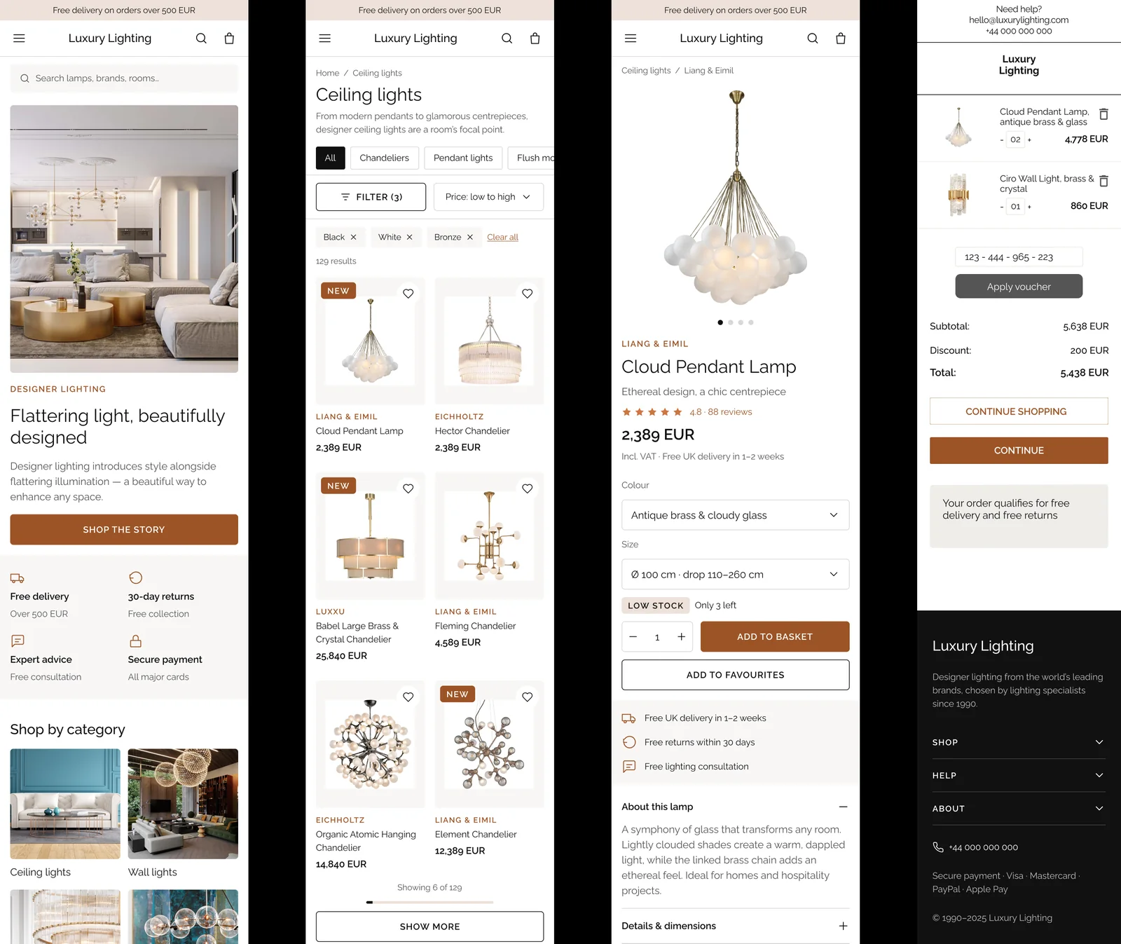 Mobile screens
Design system
A short design system keeps the pages consistent. Colours are kept as tokens. A copper is used for large decorative accents only, while text and buttons use a darker copper that passes WCAG AA against white (5.6:1). The typeface is Raleway throughout, and body text is never below 14 px.
- Ink#111111
- Text secondary#555555
- Accent strong#9C5426
- Accent#CC7641
- Beige#EEE1D9
- Beige light#F8F7F6
- Colour tokens
- Typography
- Buttons
- Badges
- Product cards
- Header
- Footer
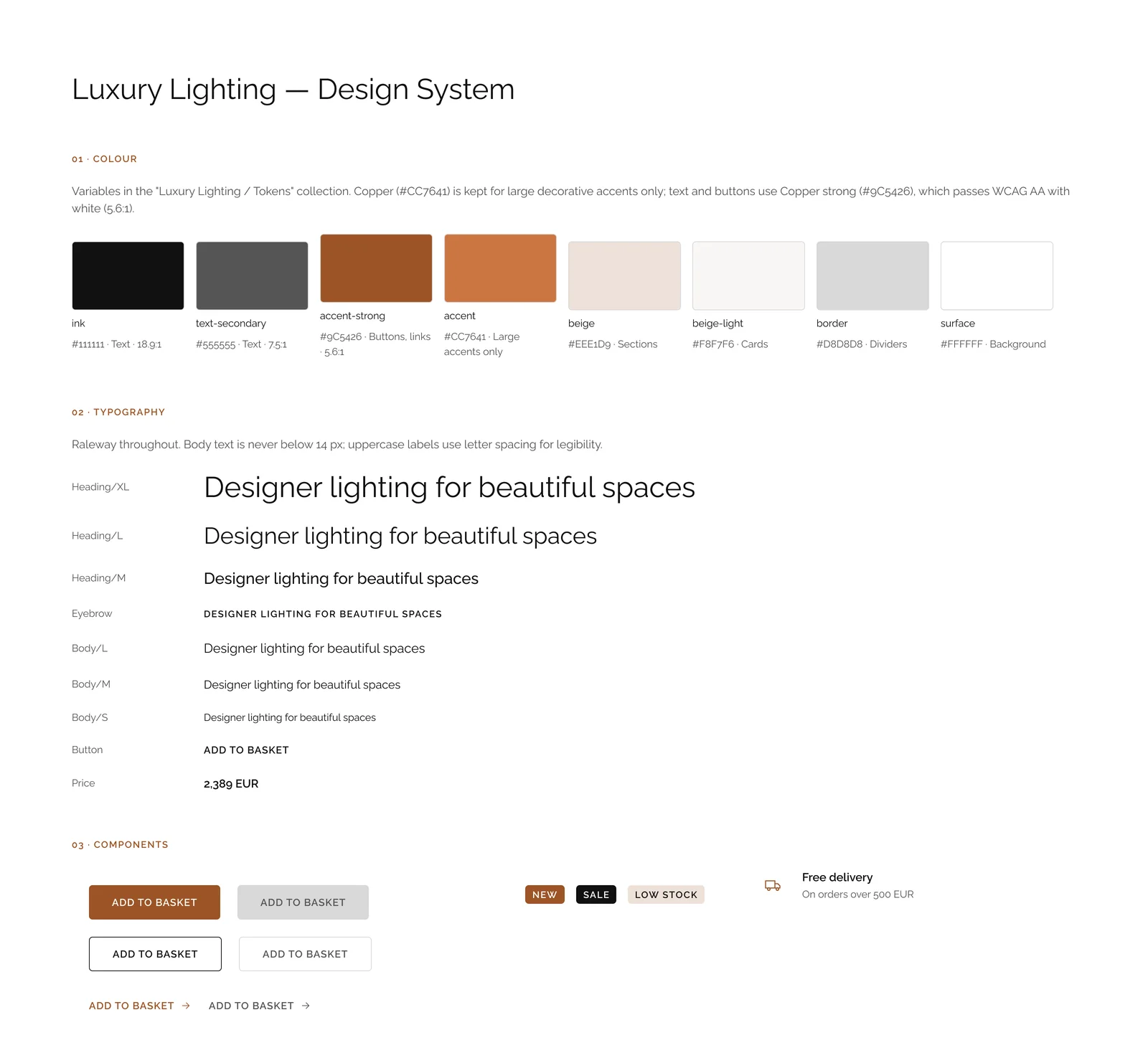 Colour, typography and components
A note on the project
This is a design project with placeholder contact details. I am happy to walk through the decisions behind any page in an interview.
Let's work together
Let's work on something together
Tell me about your project or role. A few lines about the product, the goal and the timeline is enough to start the conversation.