Work · Case study
Food experiences app: discovering cities through local, guided food tours
A mobile-first app for finding hand-picked, local-led food experiences: day trips, workshops and guided tours, with a web landing page and light and dark themes.
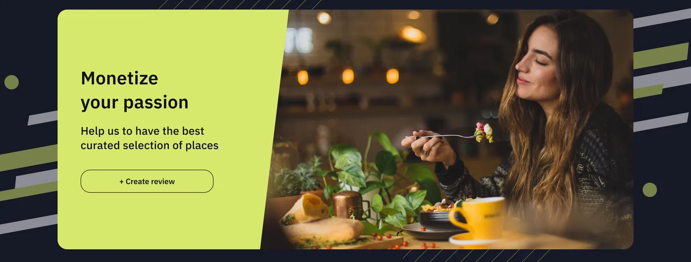
- Type
- Mobile-first app and landing page
- Status
- Prototype
- Role
- UX research, UI design
- Themes
- Light and dark
- Typeface
- IBM Plex Sans
Overview
The project started as an MVP for a startup. The client decided not to invest in the app after the tourism market was affected. I found the niche very interesting, so I built the prototype anyway, with a new UI.
The product is a mobile-first platform for hand-picked, local-led food experiences: day trips, workshops and guided tours.
The problem
According to multiple studies, 61% of travellers choose a destination for its food or drink, and 34% plan a dedicated food tourism trip. Yet many struggle to find authentic, vetted local food tours without hours of research.
A tour with someone who knows the local food culture means better information, more confidence in the quality of the places and a better experience: an insider’s view of how locals eat and where they go.
Goals
Intuitive layout
Booking travel should be fast and familiar. User research helped to understand needs, preferences and pain points.
Accessibility and inclusivity
Designing with accessibility and inclusivity in mind lets the platform appeal to a wider audience.
Optimised search and filters
Users can combine several parameters to narrow down results quickly, and each result shows its key details at a glance.
Transparent booking
Users have strict time and money limits, so anything that can affect their choice should be disclosed clearly.
Design decisions
Research shows a high willingness to invest in quality experiences, so I prioritised social proof: a prominent “Check recommendations” onboarding screen and detailed review counts on search results, to build trust straight away.
The UI goal was an intuitive, accessible interface with bold colours, a light and a dark version, a very simple user flow, onboarding pages, a modern landing page, search filters and consistent elements.
Home and onboarding
The home screen opens with a search by city and the promise of the app. Three onboarding screens follow the flow: explore cities through food, book a local, check recommendations. Each screen comes in a dark and a light theme.
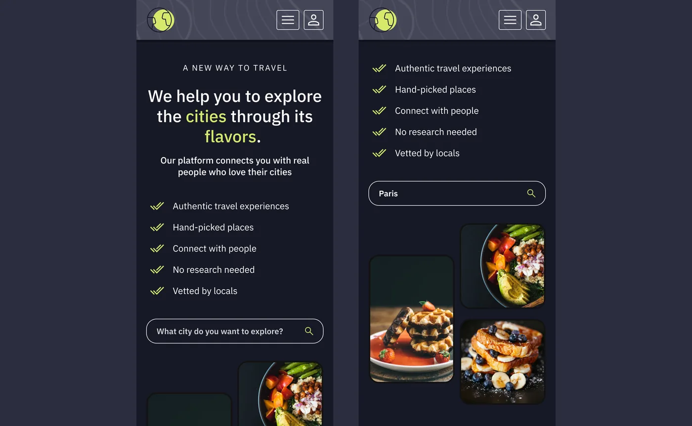 Home, dark
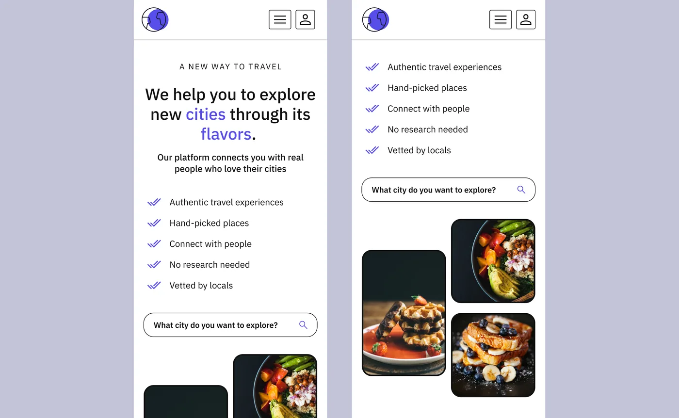 Home, light
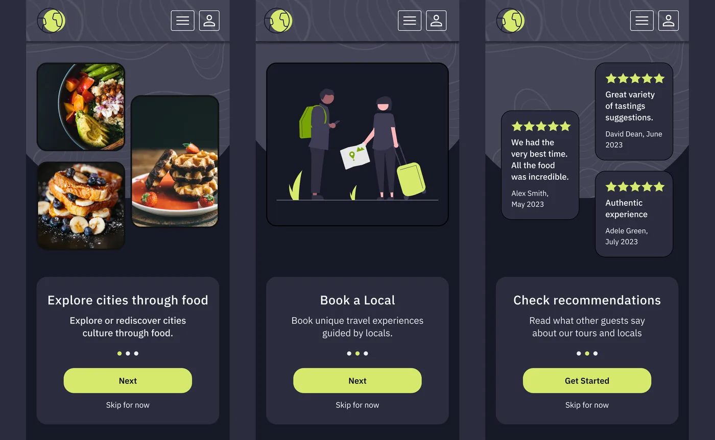 Onboarding, dark
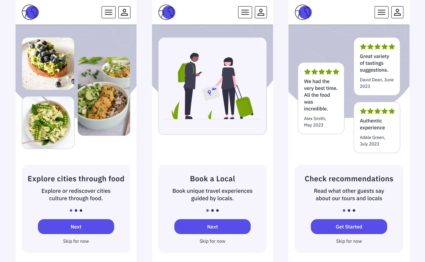 Onboarding, light
Browse and search
Experience cards show the type (workshop, day trip or guided tour), duration, city, rating, review count and price. Search results can be filtered, and a city with no matching tours gets an empty state instead of a blank screen.
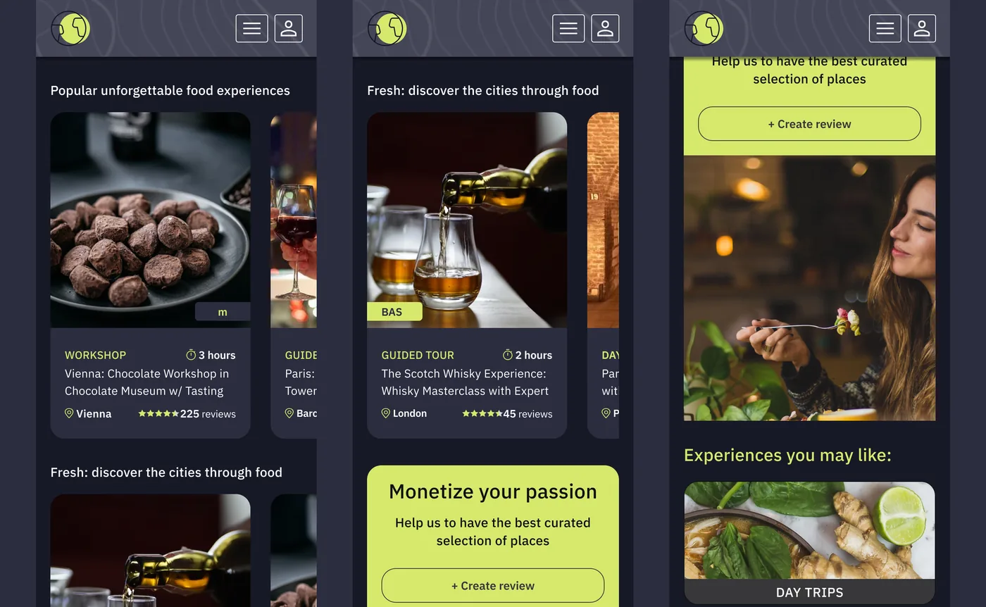 Experiences, dark
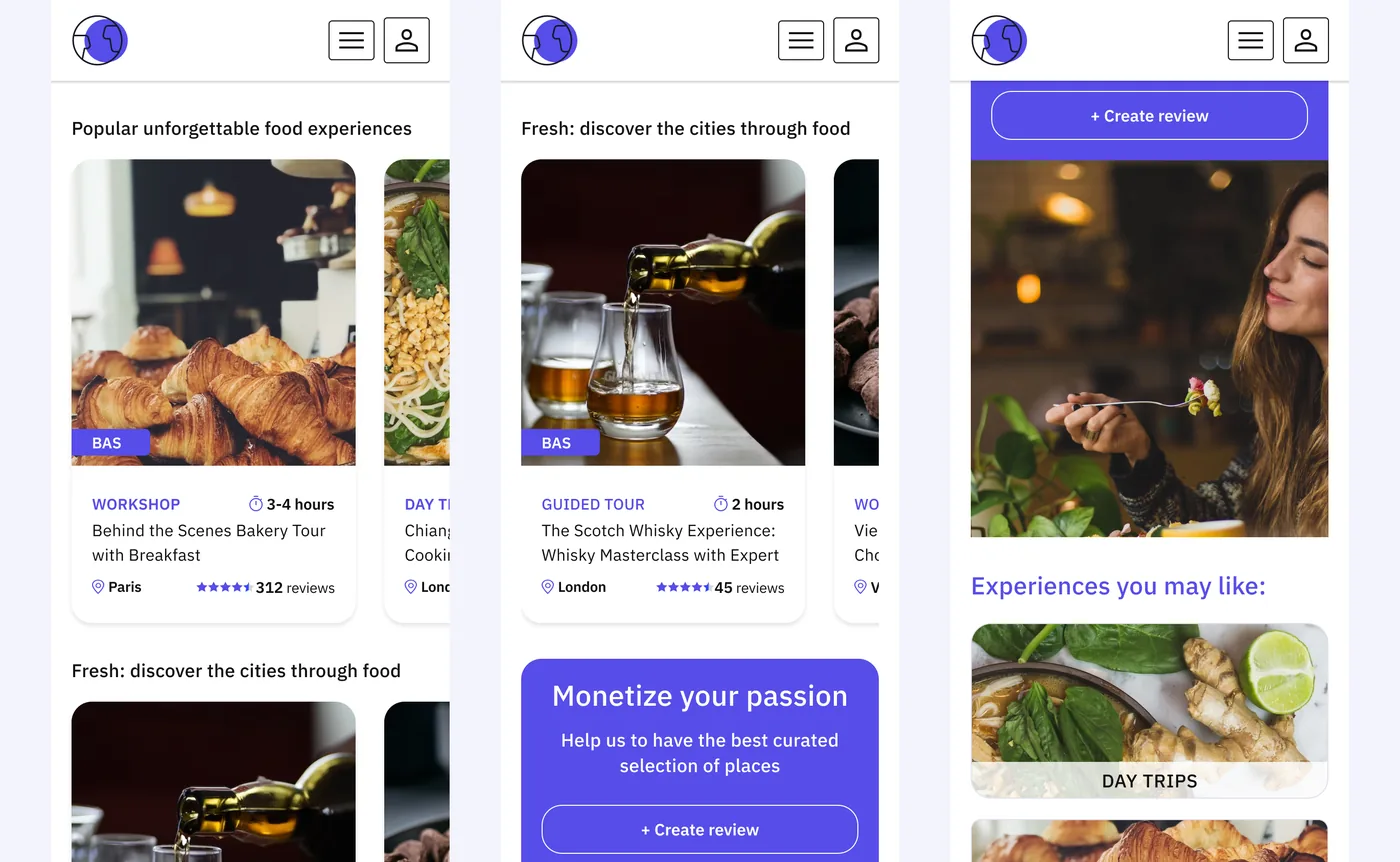 Experiences, light
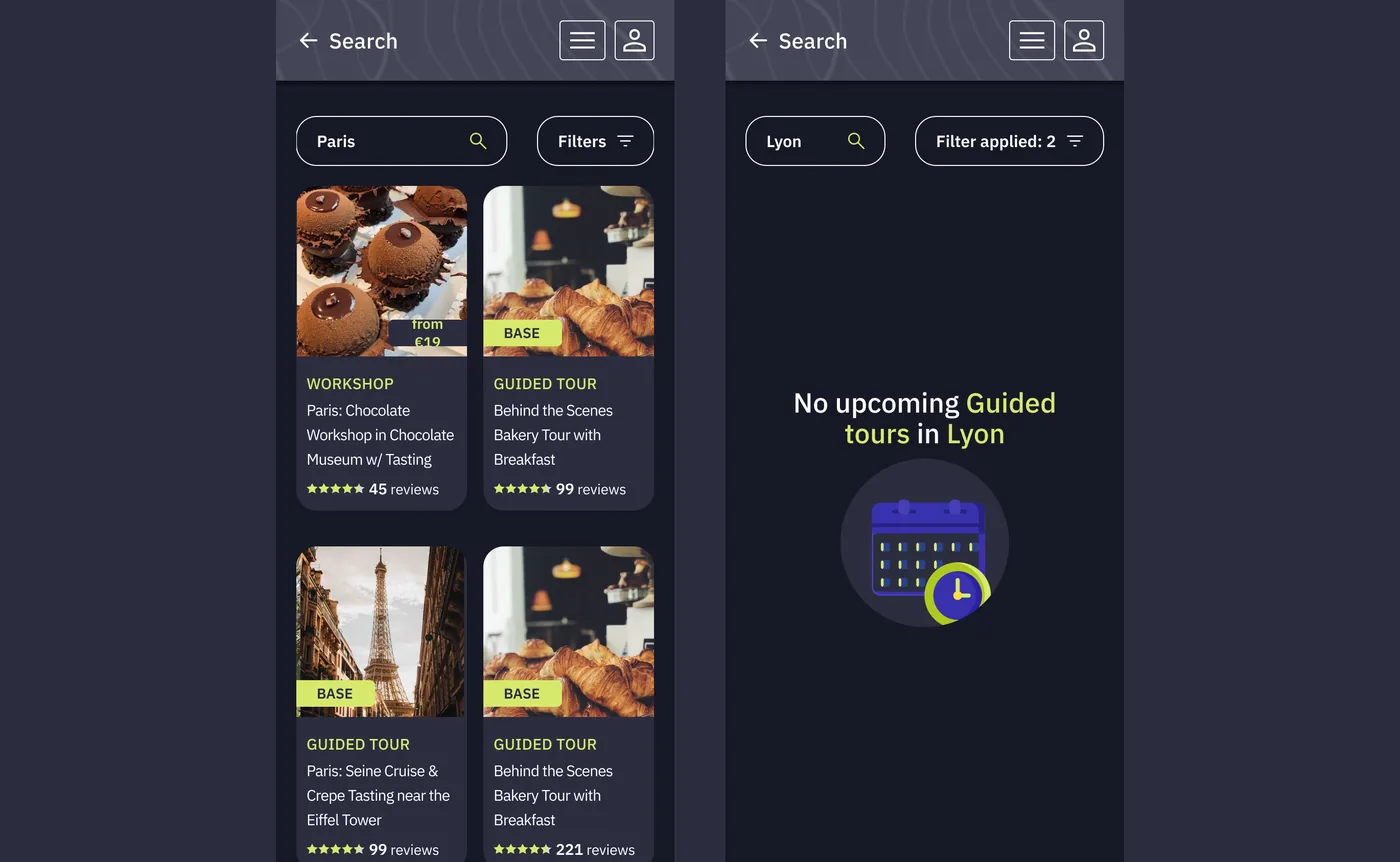 Search results and empty state
Landing page and city page
On the web, the landing page repeats the promise (authentic travel experiences, hand-picked places, vetted by locals) next to a search by city. The city page groups popular experiences and workshops, with filters for dates and prices.
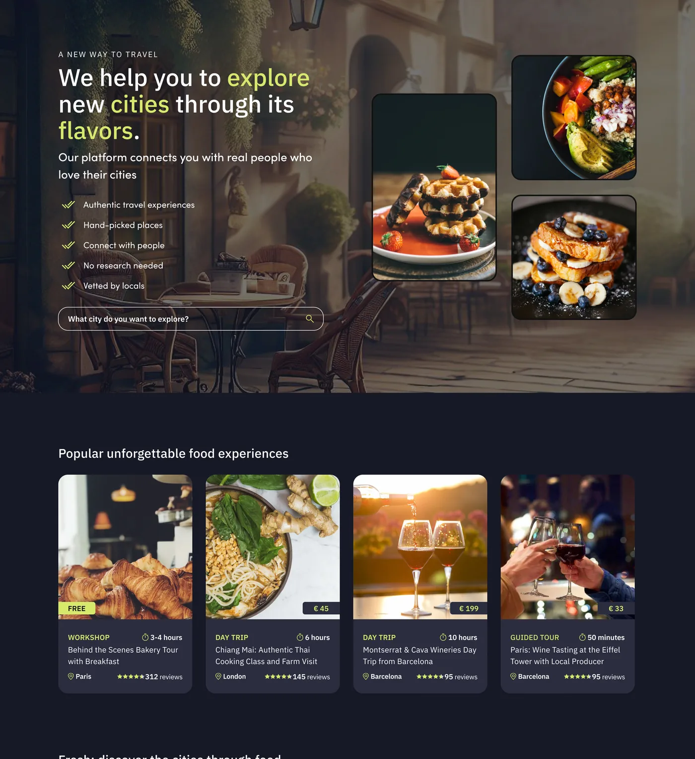 Landing page, dark
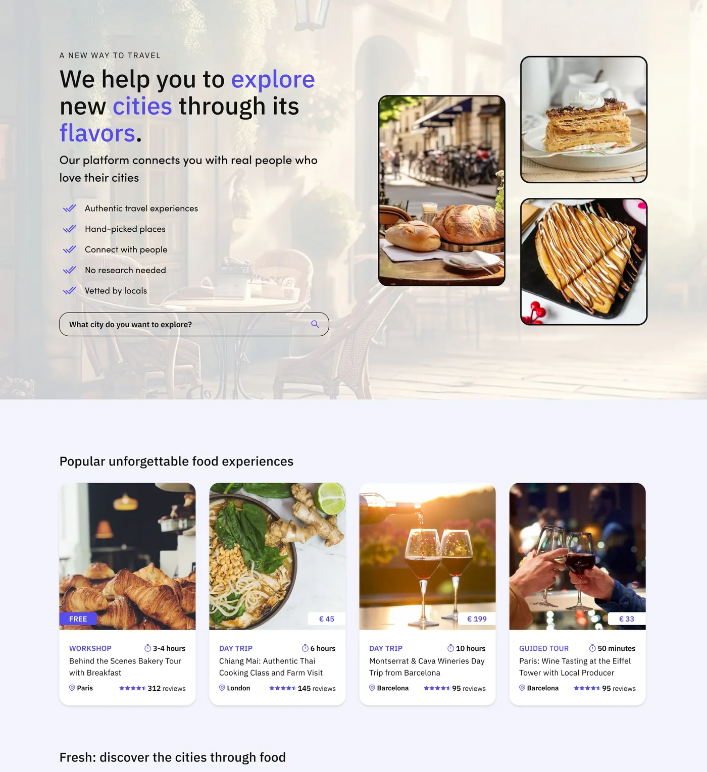 Landing page, light
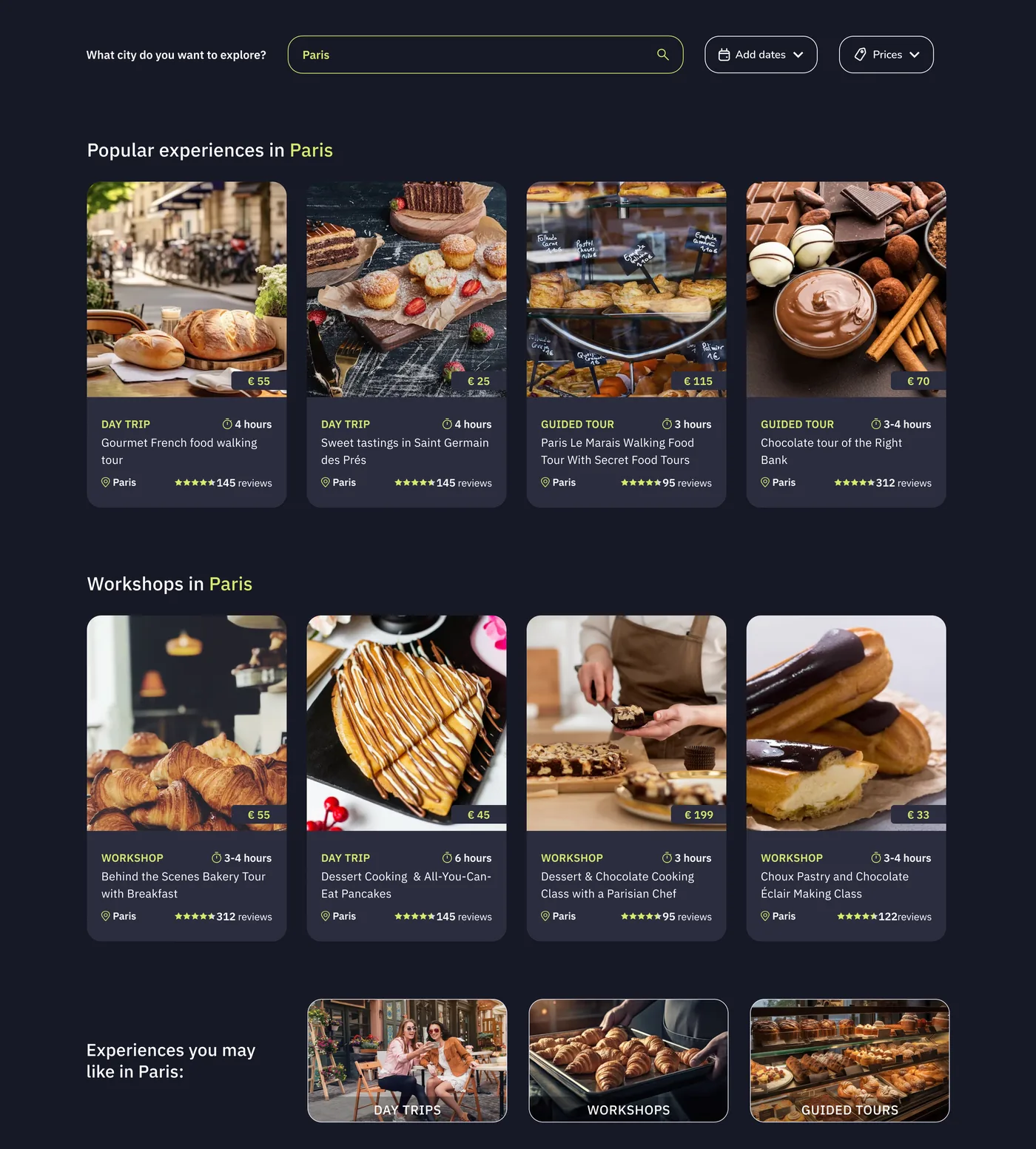 City page, dark
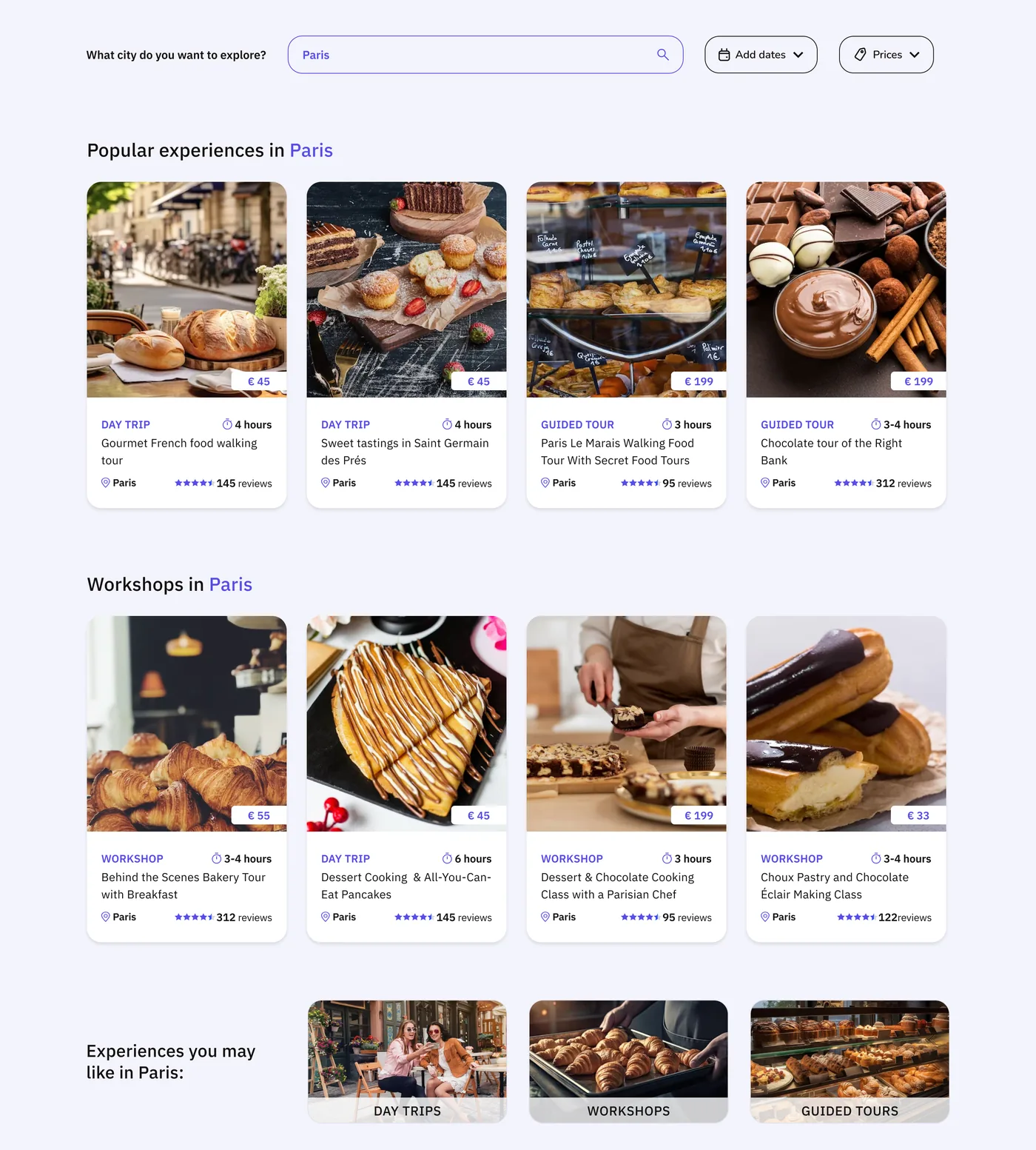 City page, light
A note on the project
This is a prototype I built on my own initiative after the original MVP was stopped. Names and logos are left out. I am happy to walk through the decisions behind any screen in an interview.
Let's work together
Let's work on something together
Tell me about your project or role. A few lines about the product, the goal and the timeline is enough to start the conversation.