Work · Case study
Car rental booking flow: clear prices from search to pick-up
A mobile UI concept for renting a car without fine-print surprises: 14 screens in 5 stages, mapped in wireframes before any colour, then designed in dark mode.
- Type
- UI concept
- Platform
- iOS, dark mode
- Scope
- 14 screens, 5 stages
- Role
- UX research and audit, wireframes, UI design, design system
- Typeface
- Plus Jakarta Sans
Overview
A UI for car rental search on iOS (375 × 812), for pick-ups around Lisbon, with prices in euros. The aim, as the cover says, is to find the right car without the fine-print surprises: every screen shows what is included, what is extra and what the total is.
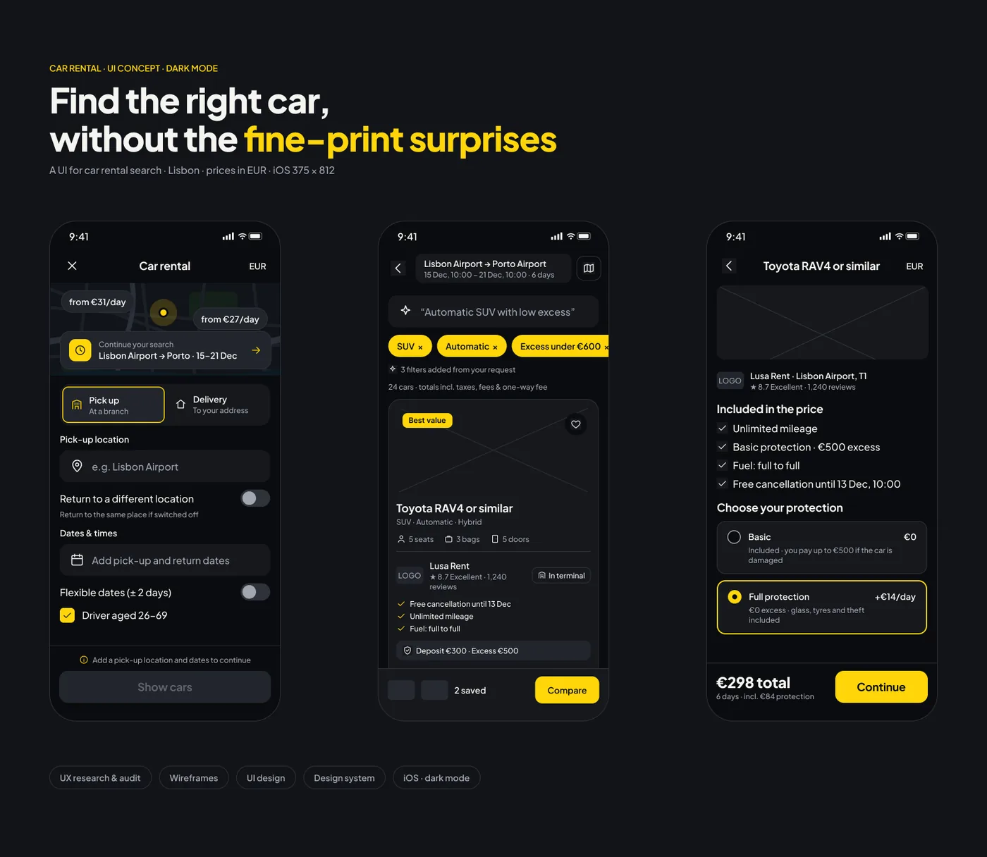 Search, results and car details
Process
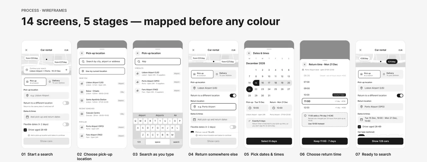
I mapped the whole flow in wireframes before choosing any colour: 14 screens in 5 stages, from starting a search to what happens when things go wrong. Colour and type came after the structure was settled.
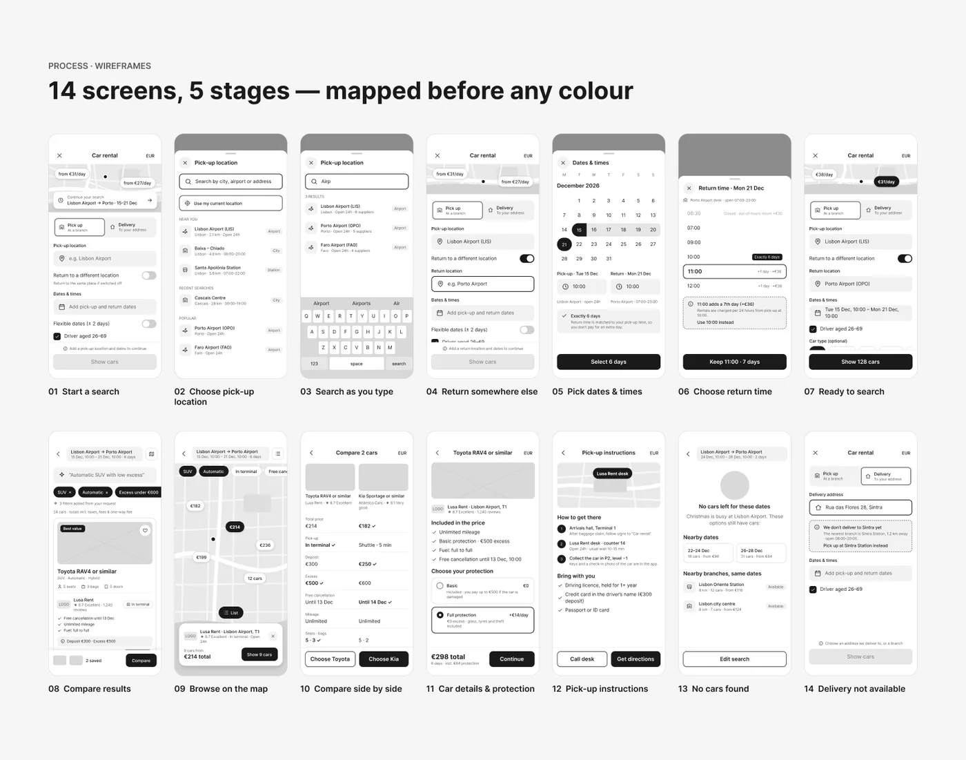 Wireframes: 14 screens, 5 stages
1. Search and location
The service type comes first, then only the essentials, and the button tells you what is missing instead of just being grey. The location sheet opens ready to type, with current location, nearby branches with distance and hours, and recent and popular places. Results appear from three characters, with the match highlighted and the number of suppliers per location.
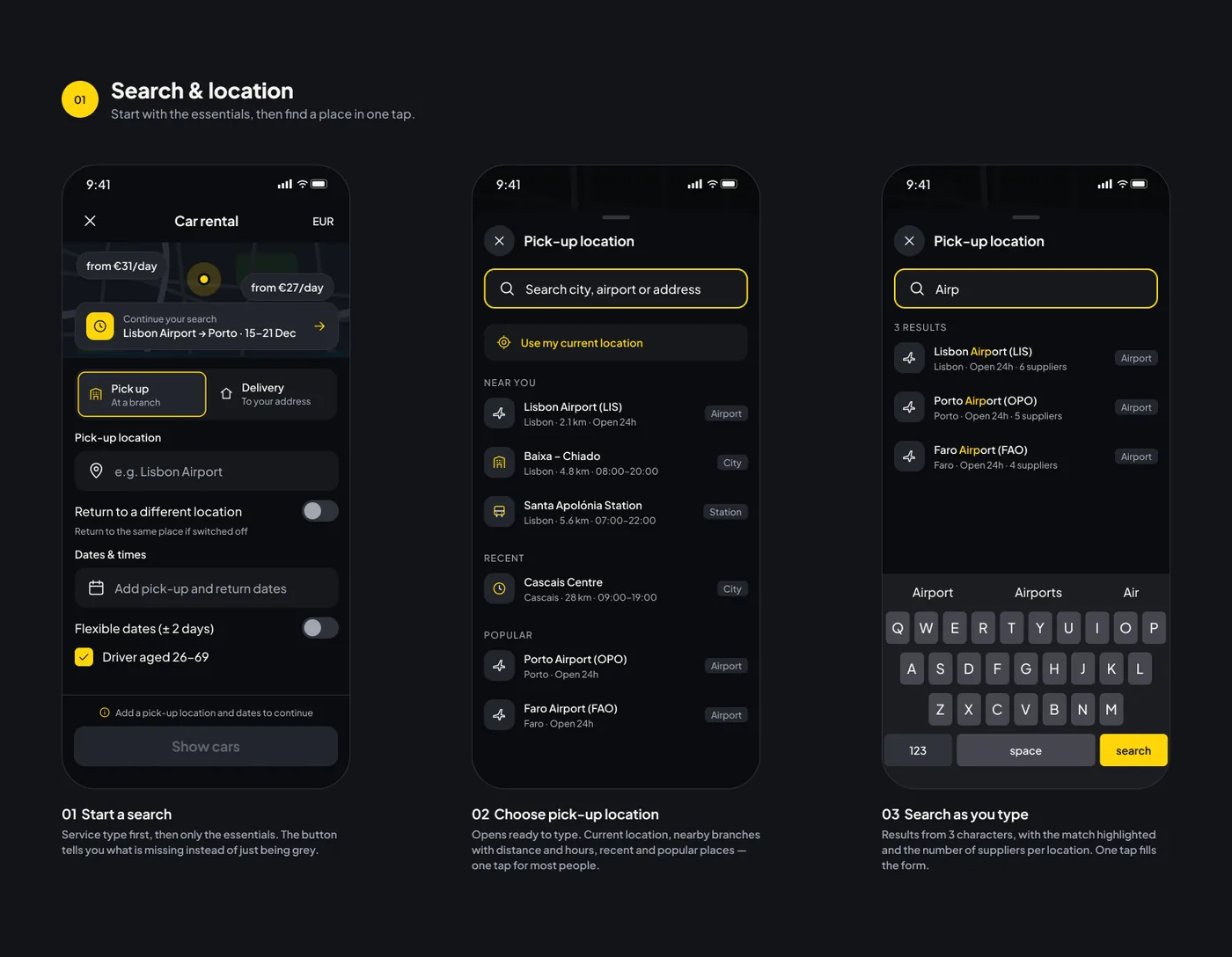 Start a search, choose a location, search as you type
2. Return, dates and times
A switch adds the return field only when it is needed. One sheet handles dates and times, and the return time is matched to the pick-up time by default, so an extra day is never charged by accident. A later time shows its extra cost up front, with a one-tap way back.
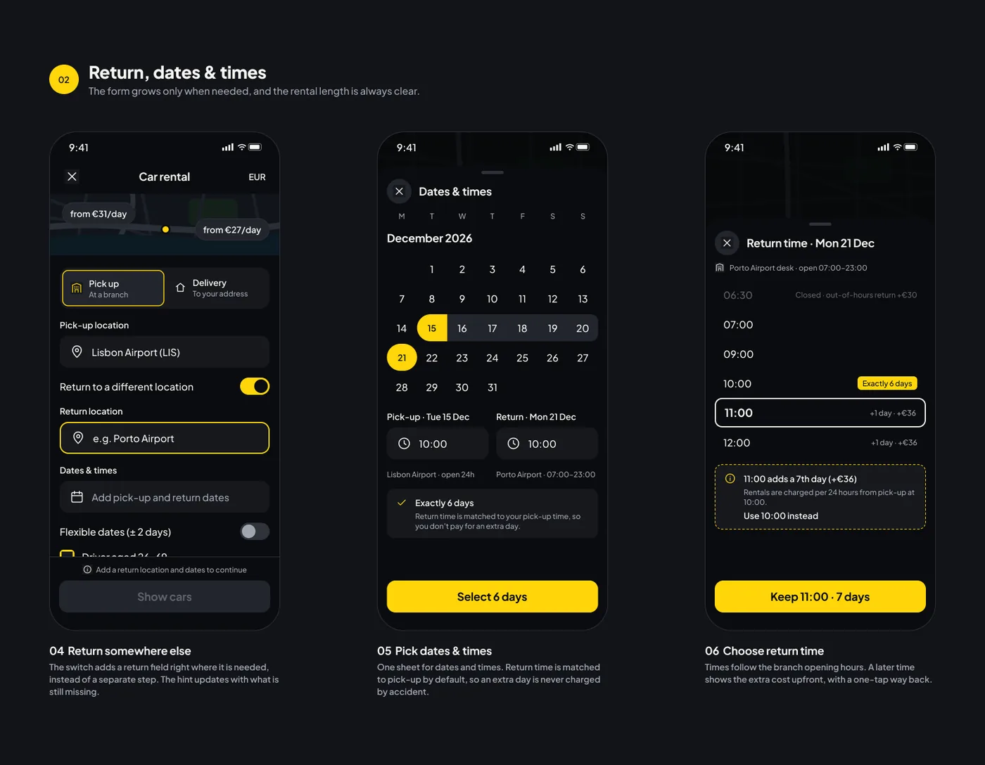 Return somewhere else, dates and times, return time
3. Results
Once the required fields are filled, the button turns on and shows how many cars match. The total price includes the one-way fee, and deposit and excess sit on every card. Natural-language requests become filter chips that can be removed. On the map, pins show the total for each branch, and tapping one previews the supplier, rating and pick-up details.
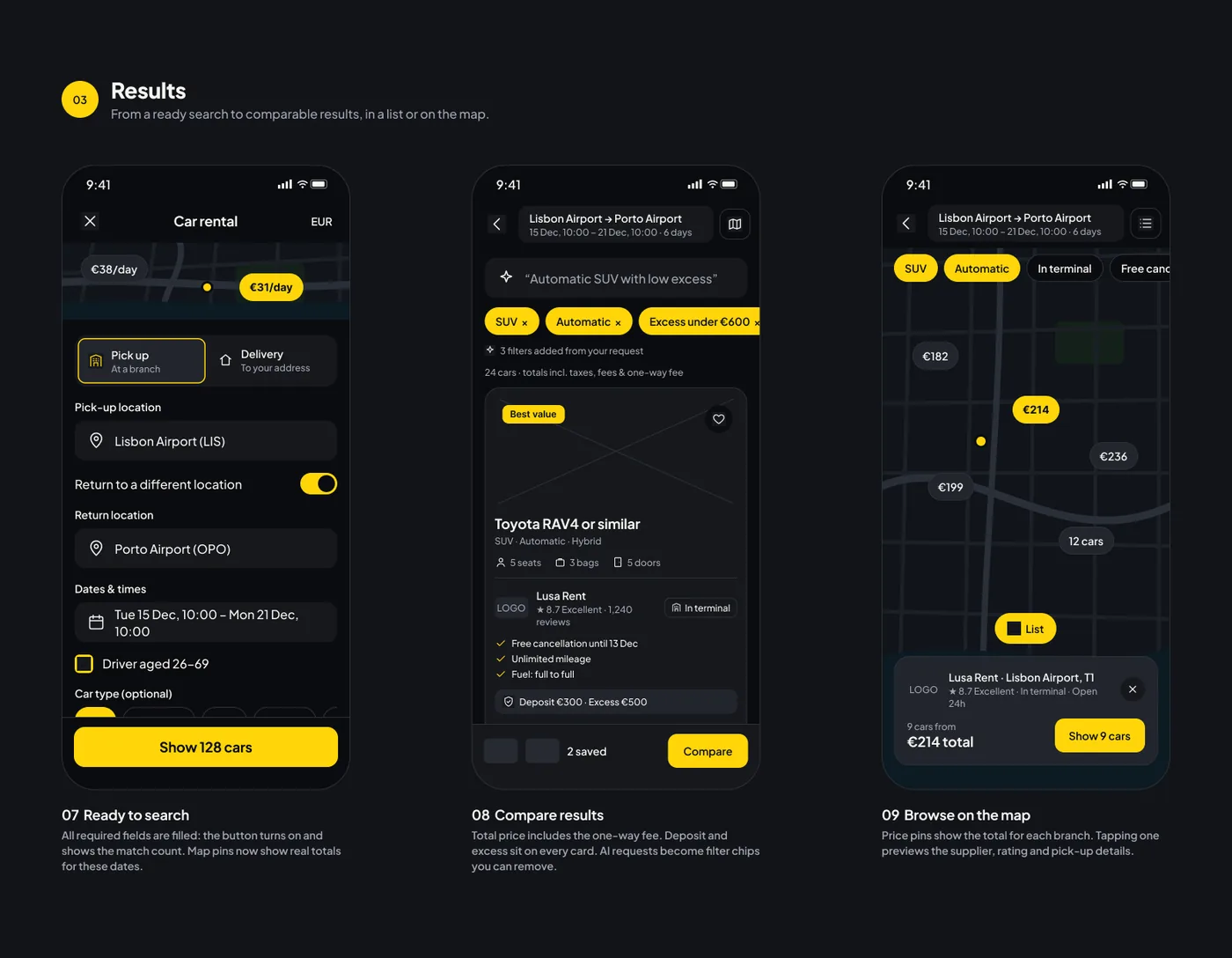 Ready to search, compare results, browse on the map
4. Decide and collect
Saved cars line up on the same rows, and the better value in each row is marked, so differences between suppliers are obvious. Everything included is listed first, and protection options show the excess and the real price difference, without jargon. The pick-up instructions say where to go, what to bring and how long it takes.
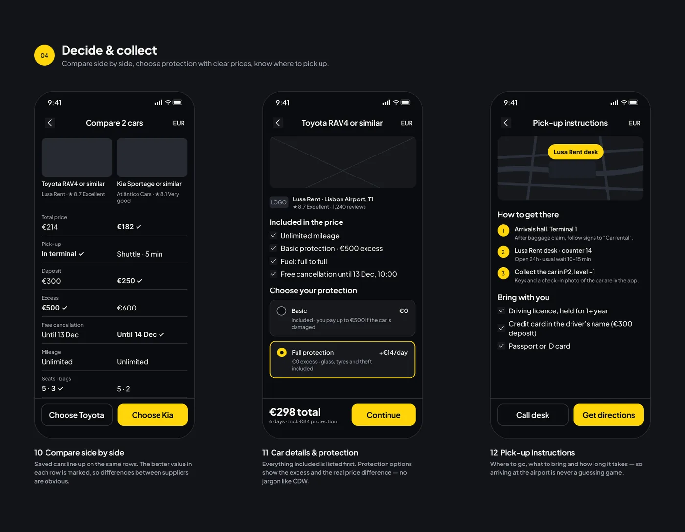 Compare side by side, car details and protection, pick-up instructions
5. When things go wrong
Instead of an empty list, the “no cars found” screen suggests the closest dates and branches that do have cars, with prices. When delivery cannot reach an address, the form says why and offers the nearest branch in one tap.
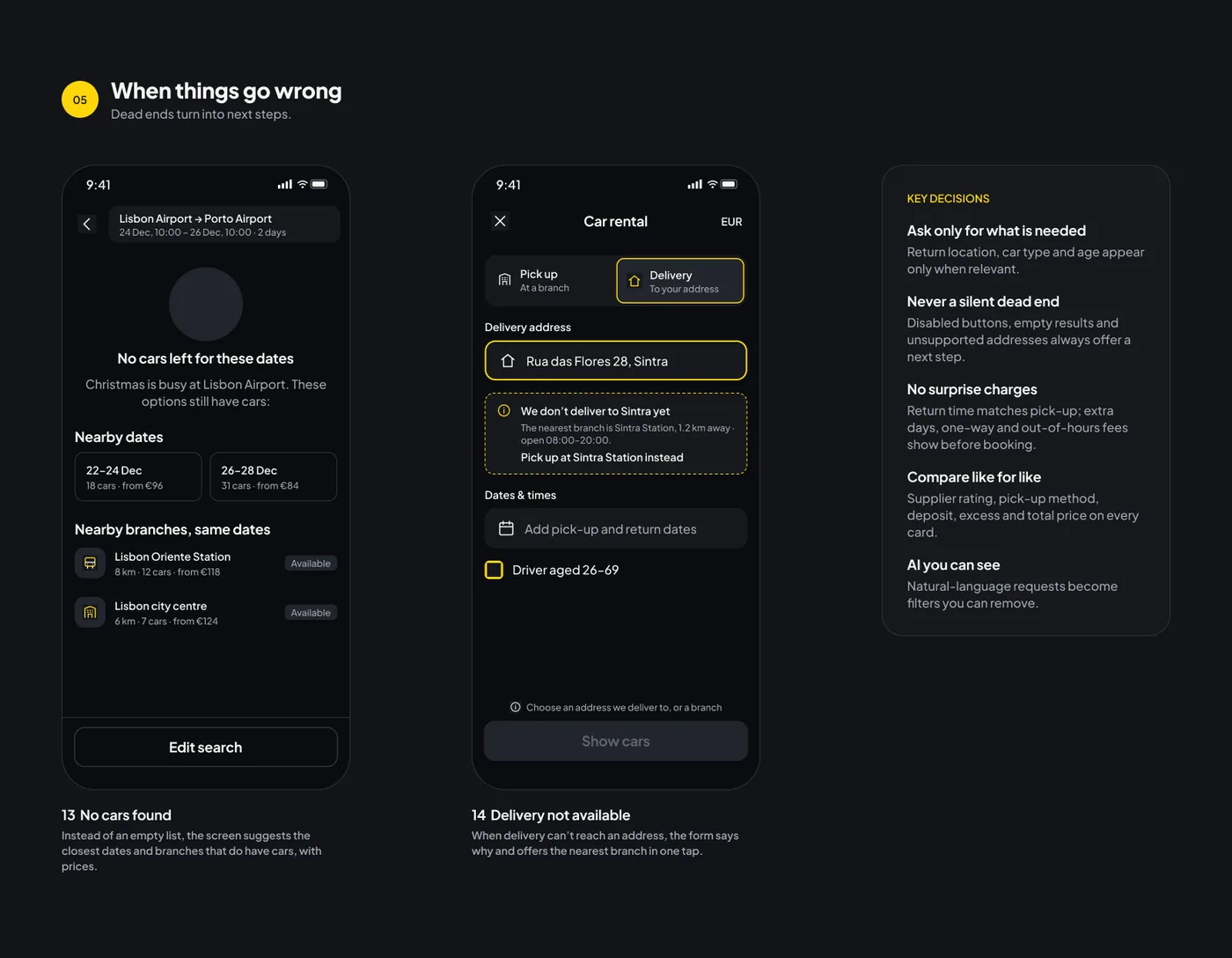 No cars found, delivery not available, key decisions
Key decisions
Ask only for what is needed
Return location, car type and age appear only when they are relevant.
Never a silent dead end
Disabled buttons, empty results and unsupported addresses always offer a next step.
No surprise charges
Return time matches pick-up, and extra days, one-way and out-of-hours fees show before booking.
Compare like for like
Supplier rating, pick-up method, deposit, excess and total price appear on every card.
AI you can see
Natural-language requests become filters that you can remove.
Design system
The wireframe components were re-themed for the dark UI with colour styles and Plus Jakarta Sans, so the components from the wireframes carry over to the final screens.
- Icons
- Button
- Field
- Toggle row
- Service type
- Chip
- Checkbox row
- Location row
- Sheet header
- App bar
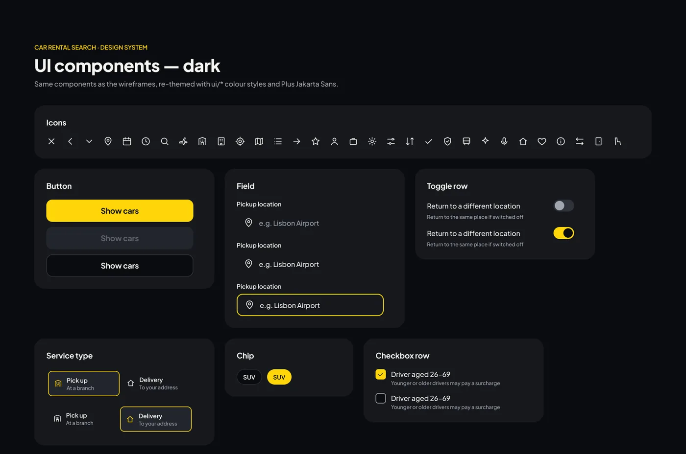 UI components, dark
A note on the project
This is a UI concept, so suppliers, prices and locations are examples. I am happy to walk through the decisions behind any screen in an interview.
Let's work together
Let's work on something together
Tell me about your project or role. A few lines about the product, the goal and the timeline is enough to start the conversation.