Work · Case study
Travel experiences marketplace: web and mobile
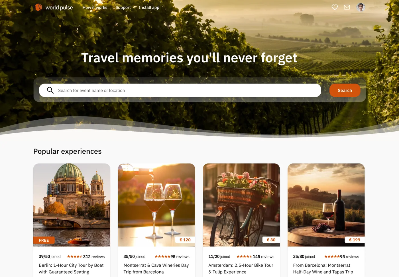
A marketplace that connects travellers with local guides for authentic city experiences, designed for two audiences on one platform.
- Role
- UX / UI Designer
- Platforms
- Web and mobile
- Audience
- Travellers and local guides
- Focus
- UX, UI, design system
- Tools
- Figma
Overview
A marketplace for local experiences: food tours, workshops, day trips and activities hosted by local guides. I designed the experience for two audiences: travellers who discover and book, and guides who build a profile and publish experiences.
This was a real client project. For confidentiality the branding is slightly modified and the client is not named. The case study shows a selection of key screens from a larger, complex platform, backed by a design system in Figma.
The challenge
Two audiences, one platform
Travellers browse and book, guides publish and manage. Each needed a clear journey inside the same product.
Discovery at scale
Long lists of experiences had to stay easy to scan, with filters for city, category, date and price and clear result sections.
Trust before booking
Joining an experience hosted by a stranger needs confidence: reviews, guest photos, a guide profile and key facts at a glance.
Dense content, simple actions
Details pages carry a lot of information, so the main action, payments and the wallet had to stay obvious.
Scope and flows
Two main journeys through the product, with the screens I designed for each. Both share the same navigation, cards and form patterns, so a guide who is also a traveller never has to relearn the product.
Traveller
- Onboarding and home
- Search and filters
- City page
- Experience details
- Login
- Add money
- Wishlist
Guide
- Login
- Create profile
- Create experience
- Public profile
Discover
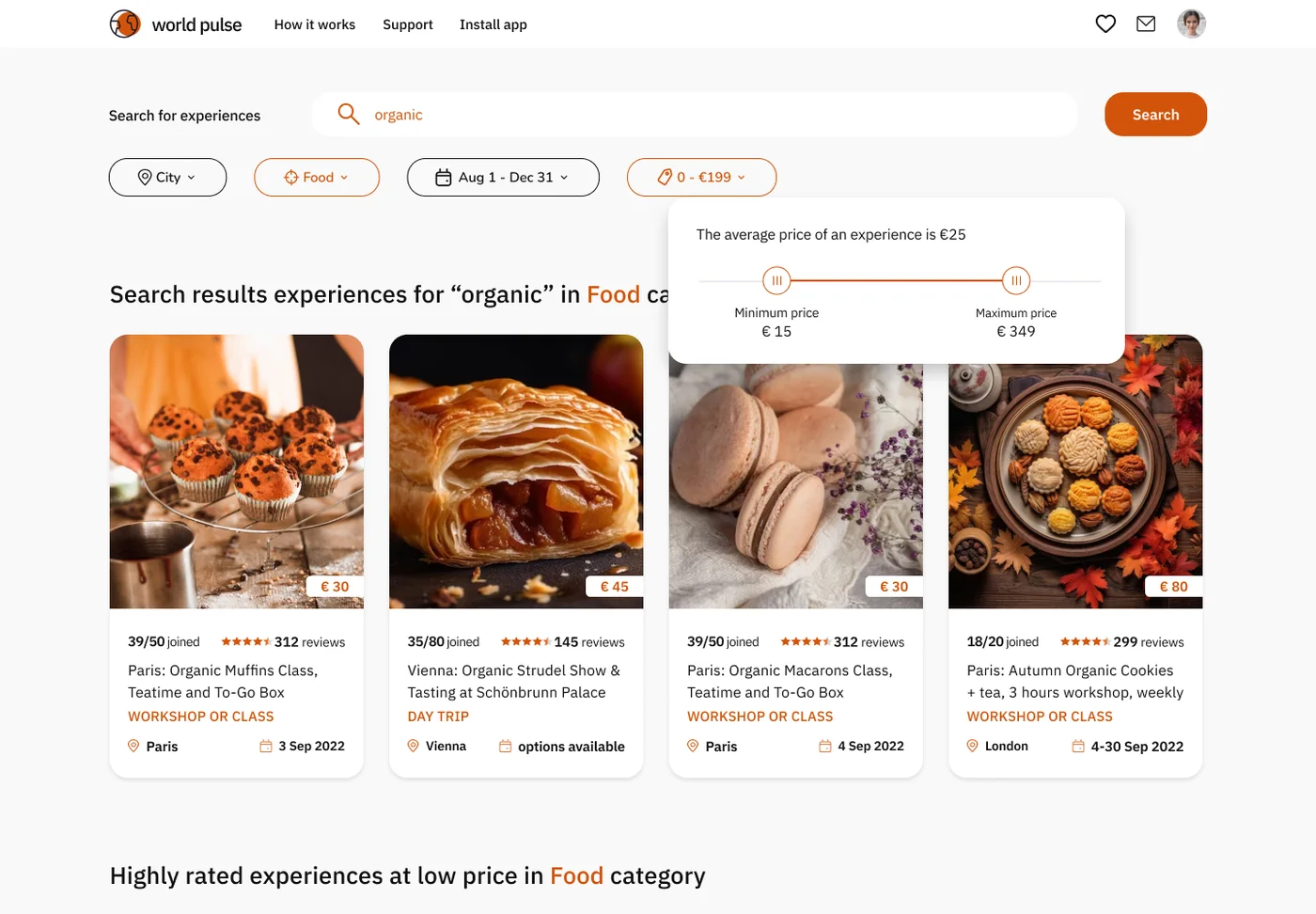
Travellers browse by city or category and filter by date and price. The filters are chips in one row, and the price filter shows the average price above a range slider, so people set a budget with a reference point.
Every result is the same card: photo, price, rating, title, type, city and date.
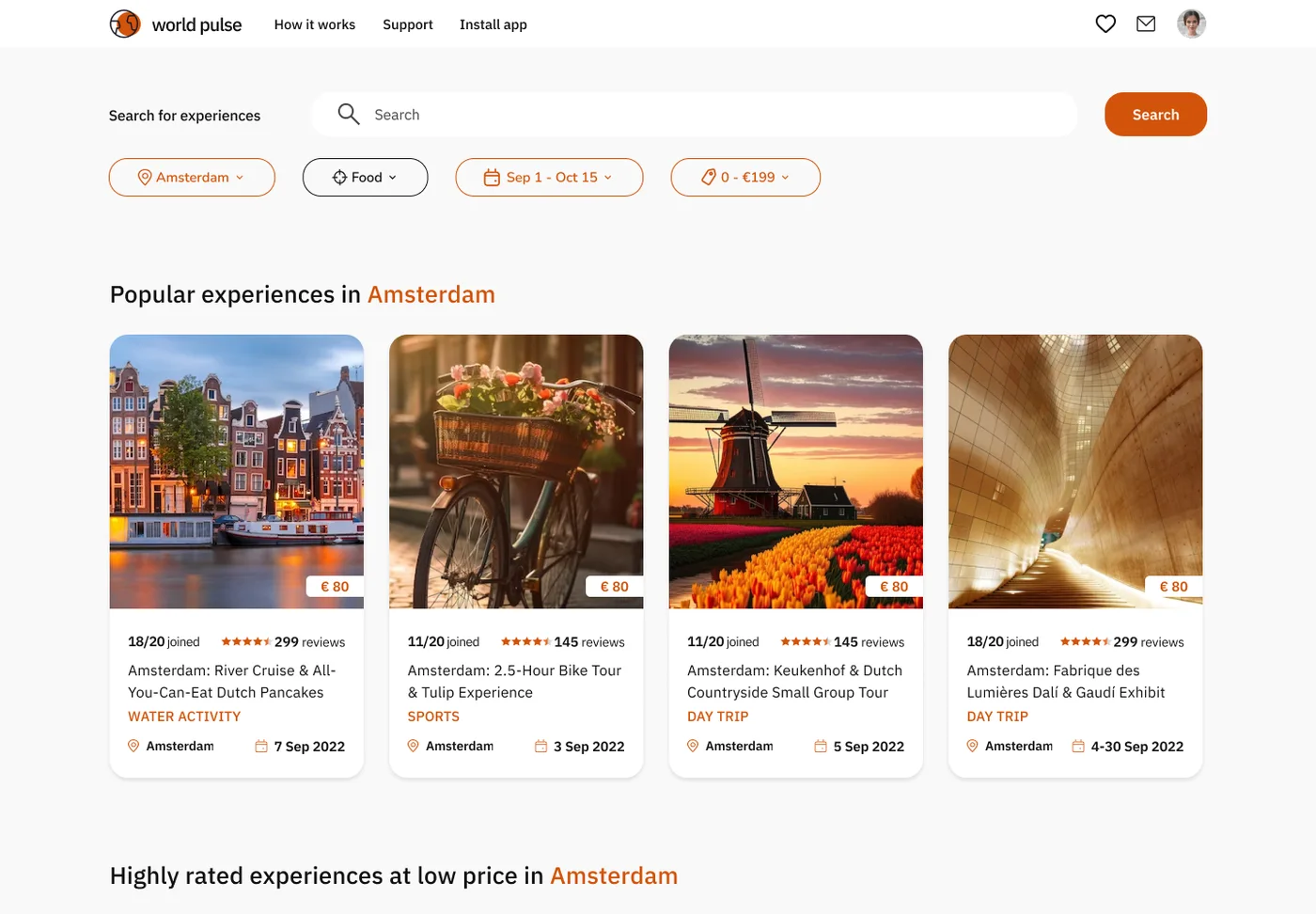
City page and wishlist
City pages group experiences by place, with the same filters and cards as search. The wishlist keeps saved experiences and lets people choose when to be reminded before an event.
Experience details
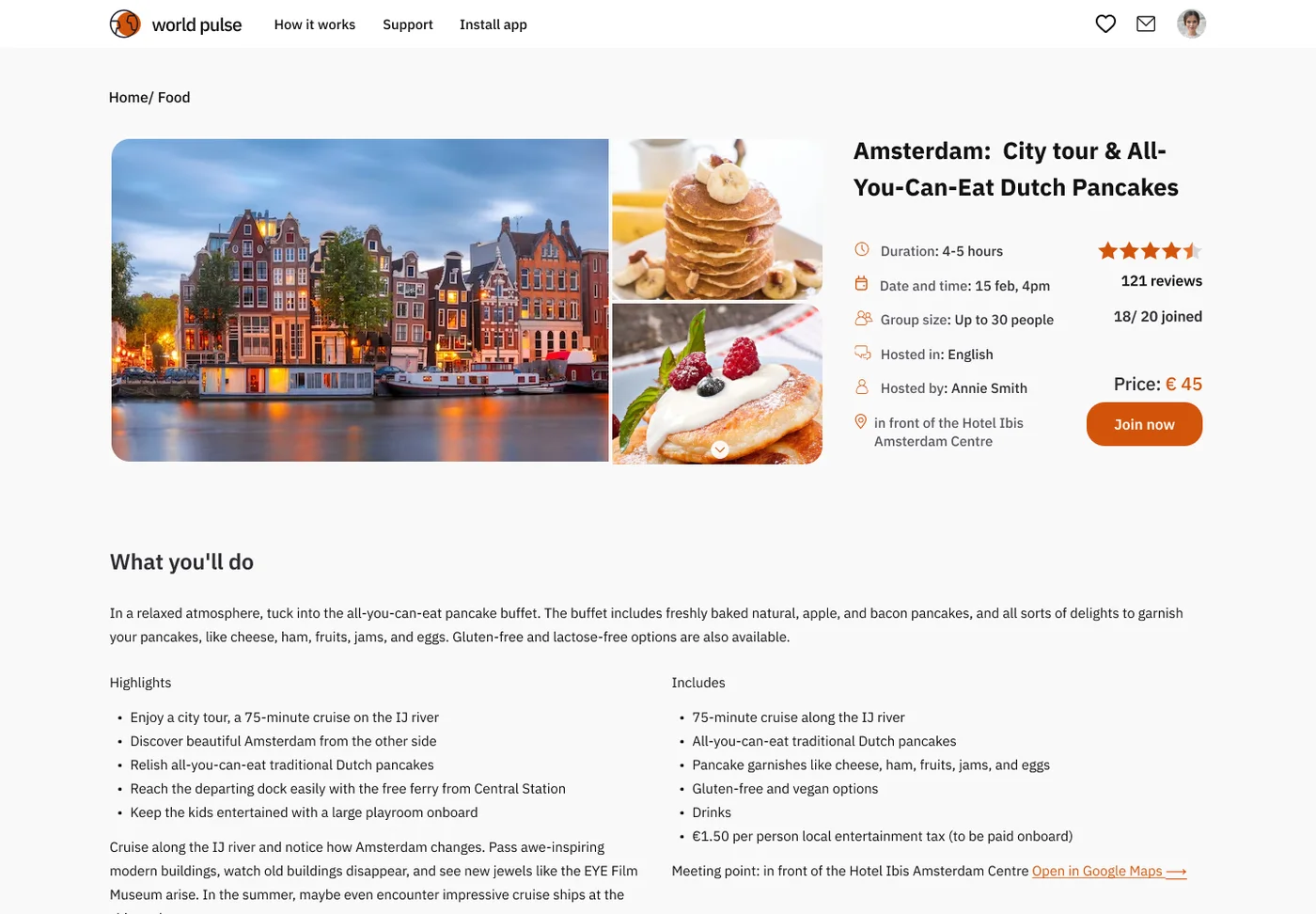
The facts a traveller needs to decide sit next to the gallery: duration, date and time, group size, language, host and meeting point, then the rating, the price and one clear action, Join now.
Below that come what you will do, highlights and what is included, the guide with a Contact guide button, guest photos and reviews. That is how trust is built before payment.
Guide tools
Guides build a profile and publish experiences with one form: city, type, title, date and time, price, duration, group size, language, a main photo and the full address. The public profile shows what travellers see: photo, bio, interests and the guide's own experiences.
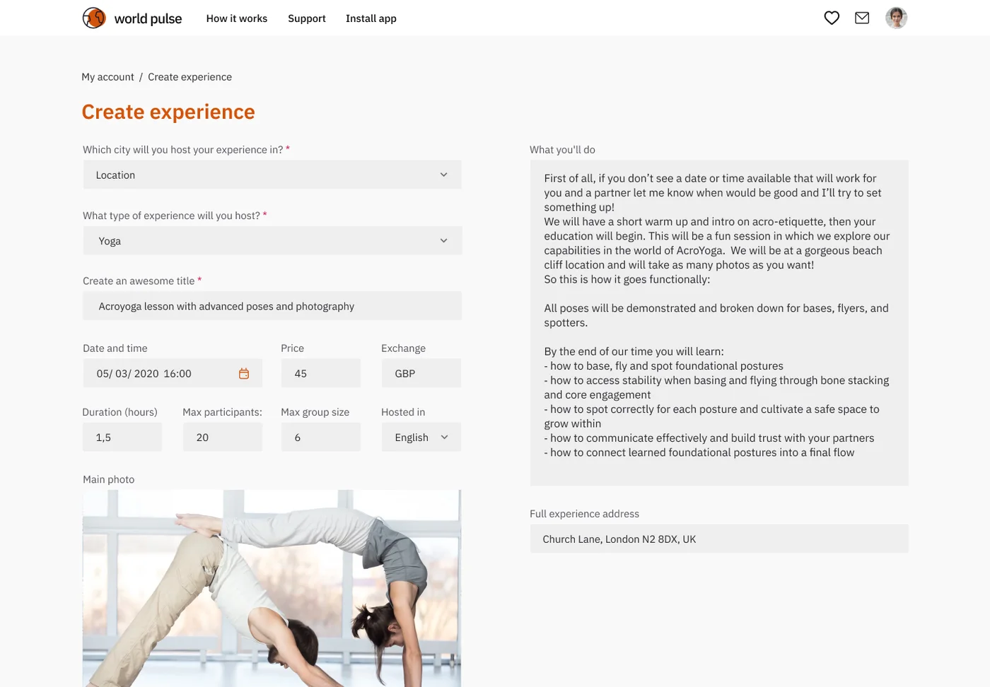 Create an experience
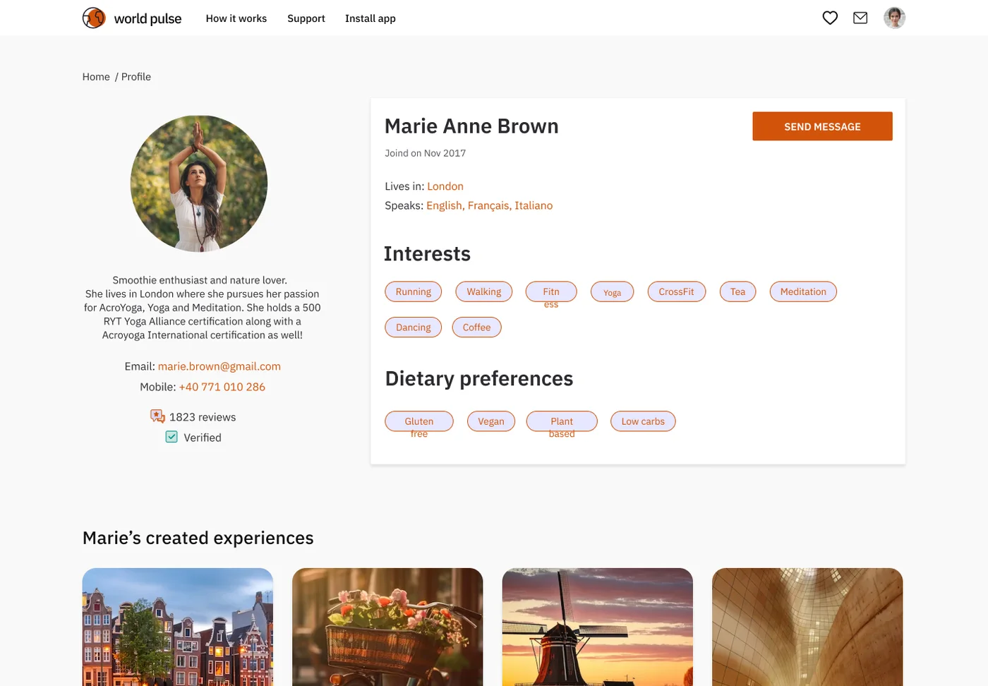 Public guide profile
Wallet
Everyone manages money in one wallet: the balance, Add money and Cashout actions, totals for the month and a transaction history. Adding money is a short pop-up, so people never leave the page.
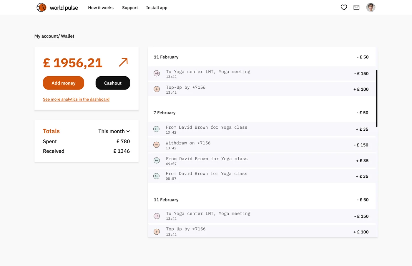 Balance and history
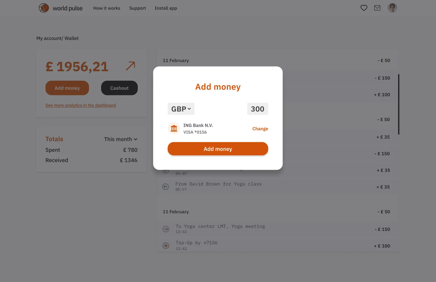 Top-up pop-up
Mobile
The mobile version starts with onboarding: a search-first screen, then a short explanation of what the platform offers.
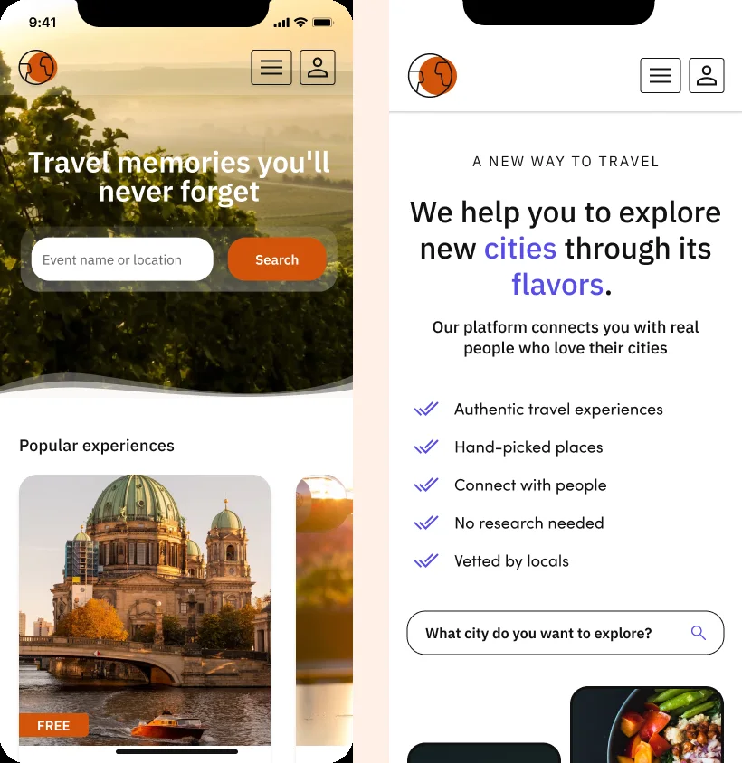 Mobile onboarding
Design system
I built a design system in Figma from the components used across the platform, so every screen follows the same rules.
One card, many contexts
The experience card is reused on home, results, city, wishlist and details.
Orange means action
Primary buttons, links, active filters, prices and category labels share one orange, so people learn what to click.
Same header and grid
Navigation, search and a four-column grid stay constant from page to page.
Predictable forms
Labels above fields, the same inputs and selects, black for secondary actions and one pop-up pattern.
- Orange#D3530B
- Black#111111
- Ink#1C1818
- Surface#F8F8F8
- White#FFFFFF
- Peach#FFD3BE
- Buttons
- Filter chips
- Experience card
- Rating
- Pop-up
- Price filter
- Pagination
- Tags
- Form fields
Typography is IBM Plex Sans, with Plex Mono for transactions.
What I would revisit
- Use one currency: cards show euros while the wallet shows pounds.
- Keep the booking summary visible on long pages, because the Join action scrolls away.
- Test which of the data points on a card people actually use.
- Check the contrast of small grey labels and placeholders.
- Run usability tests on search and booking, then track drop-off per step.
Let's work together
Let's work on something together
Tell me about your project or role. A few lines about the product, the goal and the timeline is enough to start the conversation.