Work · Case study
Fintech mobile app: sign-in, security and recovery flows
Registration, authentication and account recovery for a consumer-credit app, where every security step had to earn its place.
- Role
- UI/UX Designer
- Period
- 2023
- Platform
- Mobile app
- Focus
- Onboarding, OTP, PIN, biometrics, recovery
- Tools
- Figma, Jira
Context
A mobile app for the customers of a lender: a credit card, personal-needs loans and consumer-goods loans in one place. Customers use it to follow and pay what they owe and to manage their card.
My focus was getting in and staying in: registration, verification codes, PIN, biometrics and account recovery, plus the main screens around them.
The challenge
This was not a registration form, it was a system of states. Each starting point needs a different proof of identity.
Many starting points
A new user, a returning user, a logged-out user, a new phone and a forgotten PIN.
Many checks
SMS code, email code, PIN, biometrics, an ID photo and a face photo.
A regulated product
Money and identity are involved, so some steps cannot be removed.
A small screen
The number keypad covers half of it, so every screen asks for one thing.
UX goals
Fewer clicks per task
An interface that guides people through the available actions.
A straightforward process
Remove every unnecessary step.
No friction in onboarding
Around registration and the first sign-in.
Explain why security matters
Communicate the importance of security regulations instead of hiding them.
Scenarios
Seven scenarios, each tied to its own Jira ticket and designed in every state. PIN reset has three levels, and the level depends on the risk.
Account changes
- Change phone
- Change email
- Log out and in
- Reinstall or new device
PIN reset, by risk
- Code only
- ID photo
- Selfie after full eKYC
How I worked
Agile team
One Jira ticket per scenario, with every flow tied to its ticket.
Benchmark first
I studied how other financial apps, such as Revolut and Raiffeisen, handle access and recovery before drawing the first screen.
Every state, then specs
Empty, typing, error and success, then annotated specs for developers: design tokens, layout rules and open questions marked to be discussed.
Key decisions
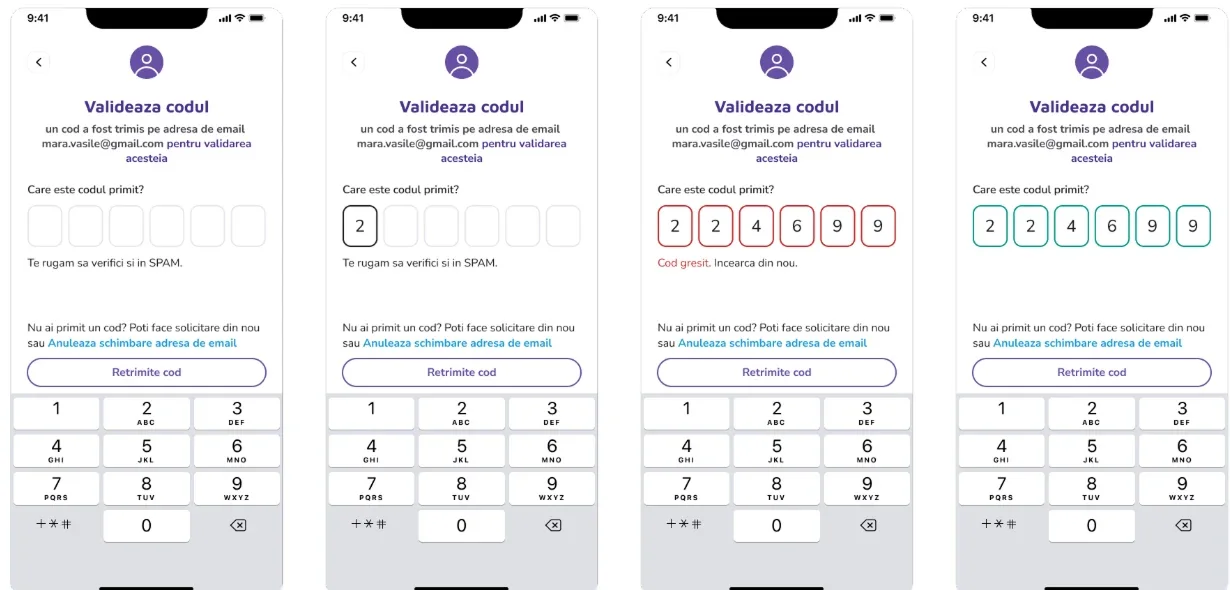
One OTP component, five states
Phone and email codes behave the same everywhere, so users learn the pattern once and developers build it once.
Edit details in place
I compared flow variants. Asking for the PIN before every edit added a step without real protection, so I dropped it and added a clear success screen.
Recognise returning users
A masked phone number on the sign-in screen tells returning users the app knows them.
Recovery proportional to risk
A code for small changes, an ID photo or a selfie only when the risk justifies the effort.
Visible feedback on the PIN
The dots turn purple, red or green and a line of text says what happened, so colour is never the only signal.
A home that answers two questions
What do I owe, and when? Those answers come first.
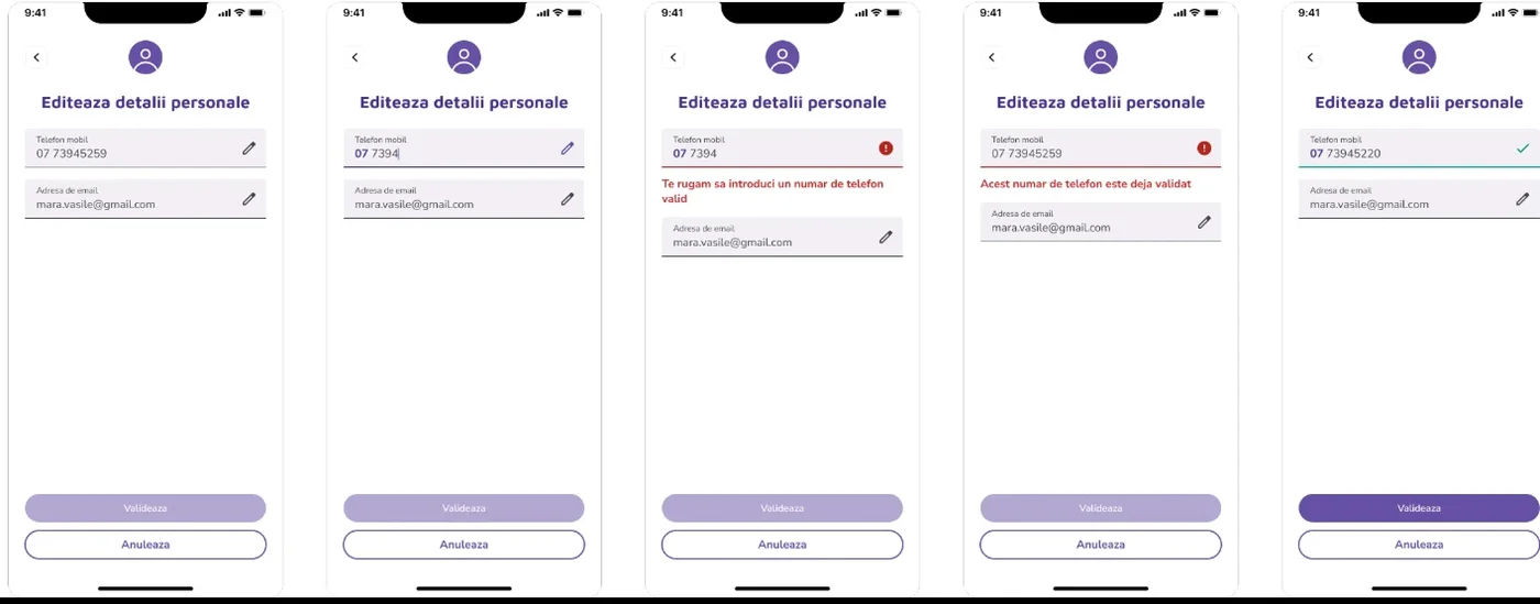 Editing details in place, in four states
The main screens
Around the access flows I designed the five areas of the app: Dashboard, Due payments, Credits, Transactions and a More menu with the profile. The Due payments screen leads with the minimum amount and its date, with the Pay button next to it.
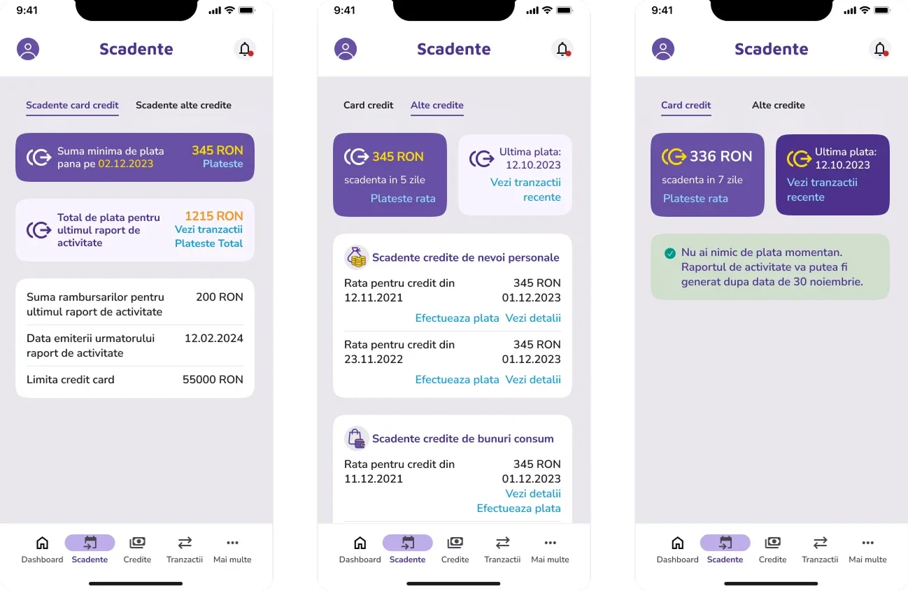 Due payments
What I would revisit
- Test PIN recovery with real users and watch where they hesitate.
- Close the open questions in the specs, such as code validity and the time between requests.
- Align code length: the SMS code has four boxes and the email code six.
- Check the contrast of disabled buttons.
- Reopen the decision to write the Romanian copy without diacritics.
- Track drop-off per step to see which screens still lose people.
A note on screens
This work is under NDA, so the client name, logo and most screens are not shown. I am happy to walk through the flows and decisions in an interview.
Let's work together
Let's work on something together
Tell me about your project or role. A few lines about the product, the goal and the timeline is enough to start the conversation.